Finanta Brand Identity
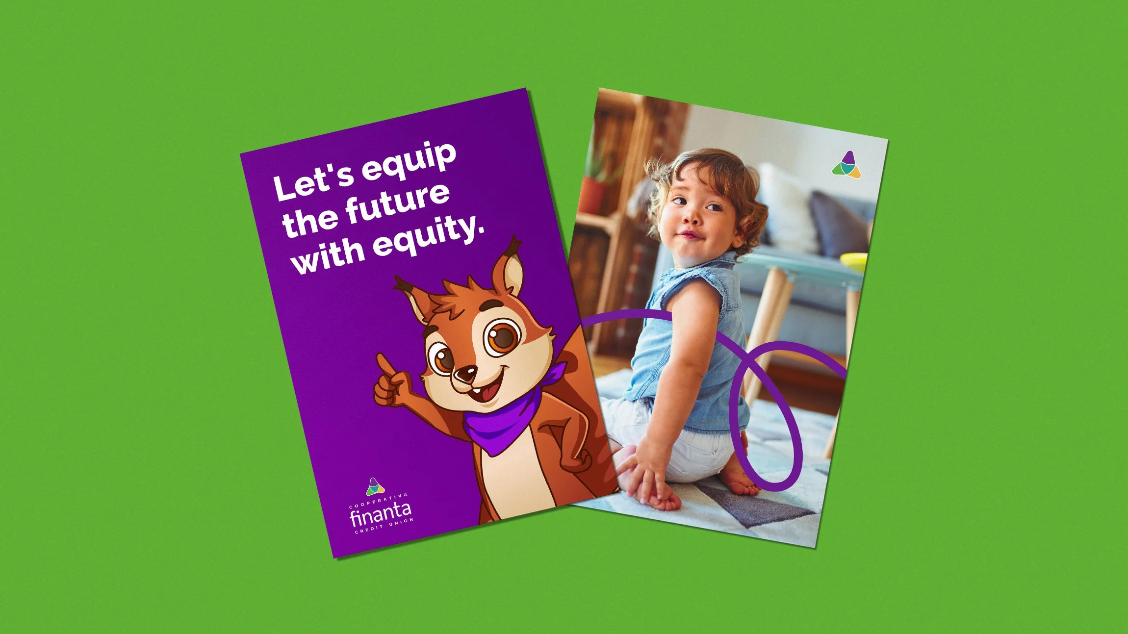
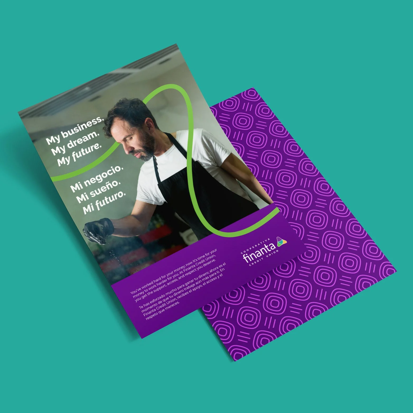
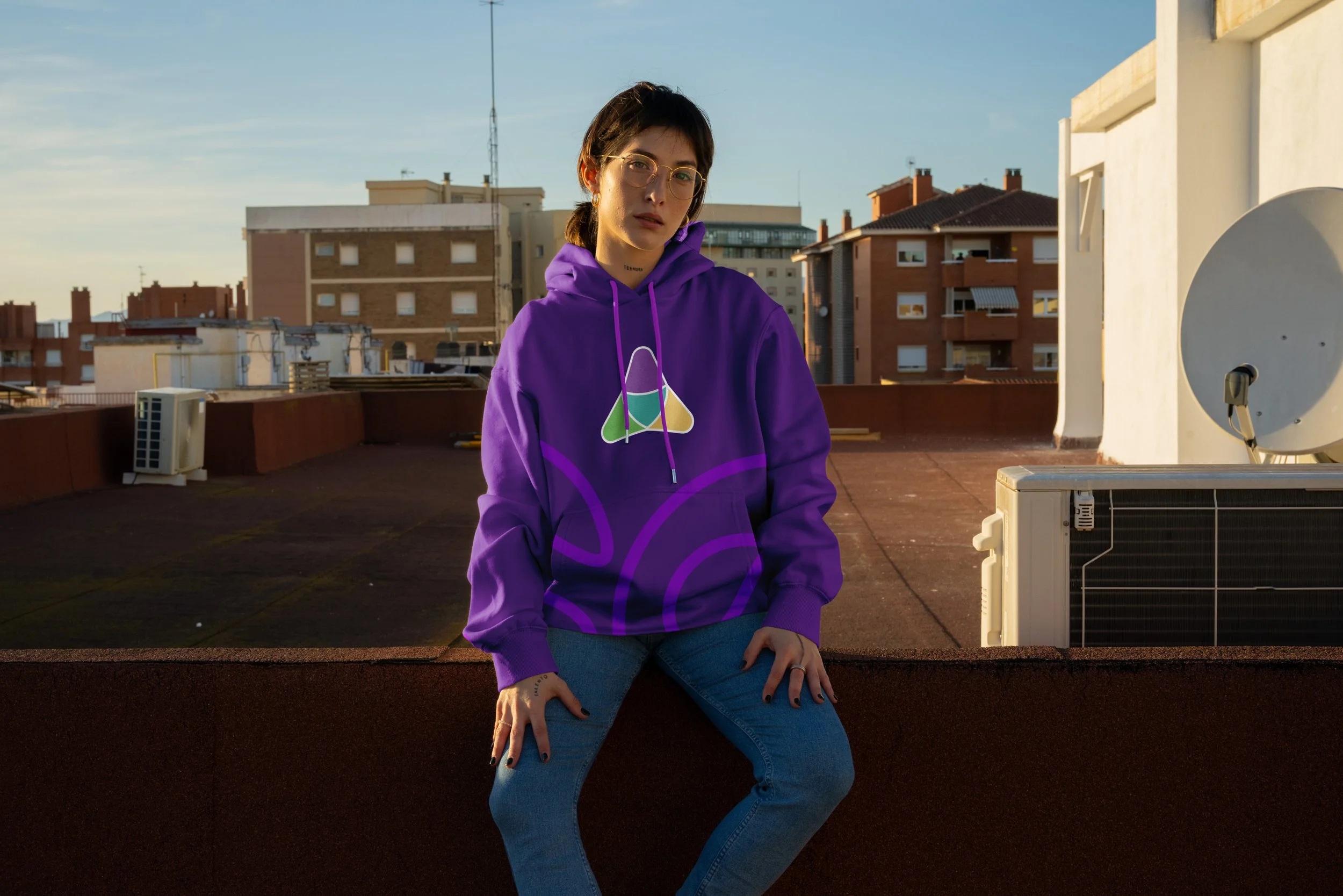
Finanta is a Pennsylvania-based credit union with deep roots in Latino communities across the state. Looking to refresh their visual identity, they asked us to evaluate and evolve their existing brand system. Through a comprehensive brand audit, we identified visual gaps, inconsistencies, and opportunities to create a more cohesive identity. The result was a distinctive, ownable brand system that authentically reflects who Finanta is and connects with the communities they serve.
I led this project from start to finish, pitching and winning the business in early spring, to finalizing the brand guidelines in early summer. Throughout this process, I guided a small design team while remaining hands-on in the creative work, helping bring the new brand identity to life.
It started with their story
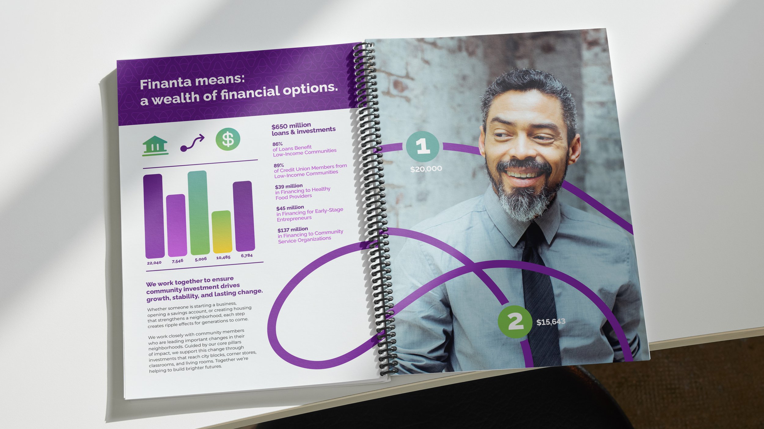
We immersed ourselves in Finanta’s origins, community residents and entrepreneurs, and future businesses goals. Beginning with their existing brand elements, we successfully developed a refreshed brand system built for long-term use. Final deliverables included new assets and a comprehensive, structured brand guide with practical examples for current and future employees.
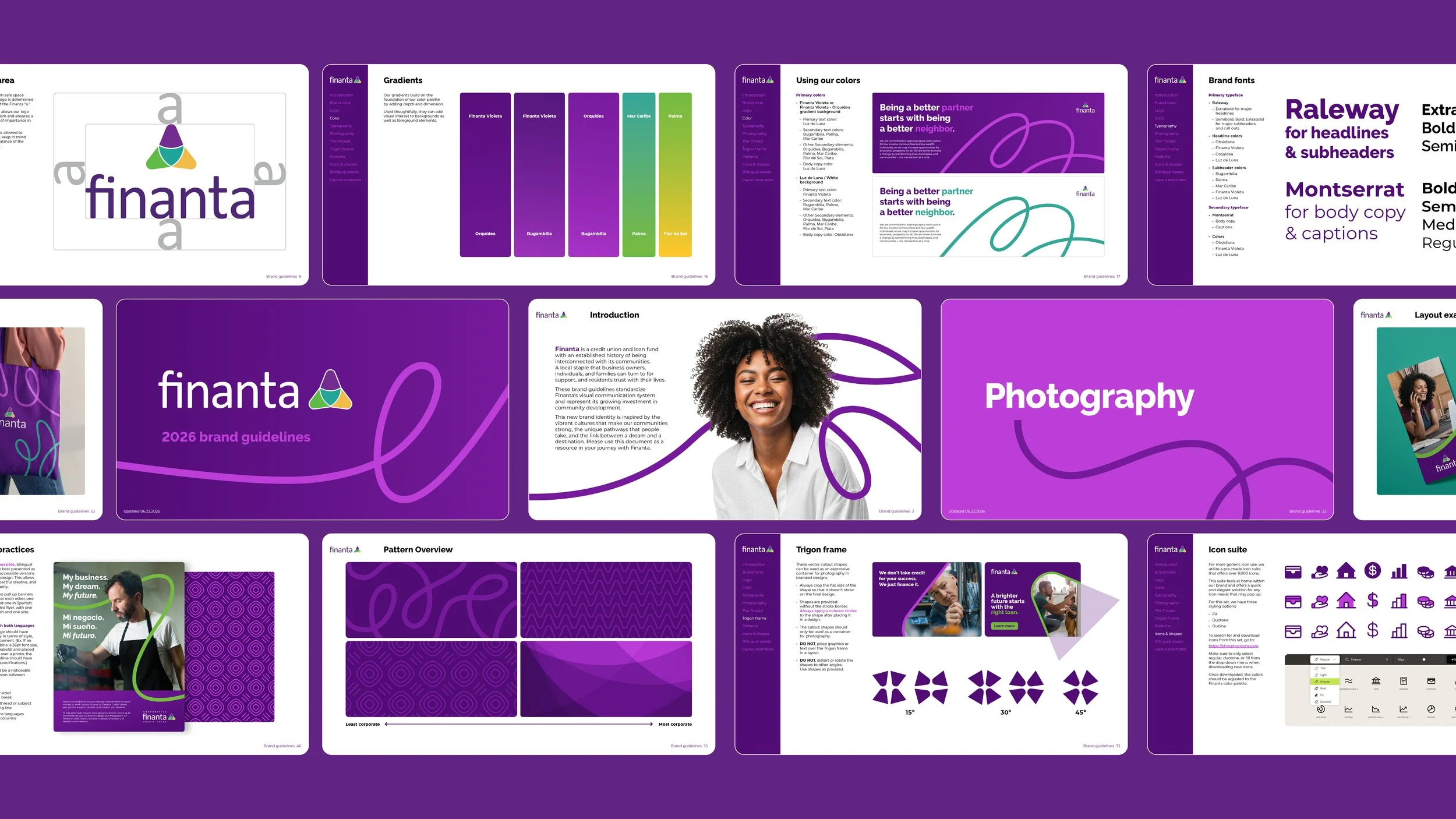
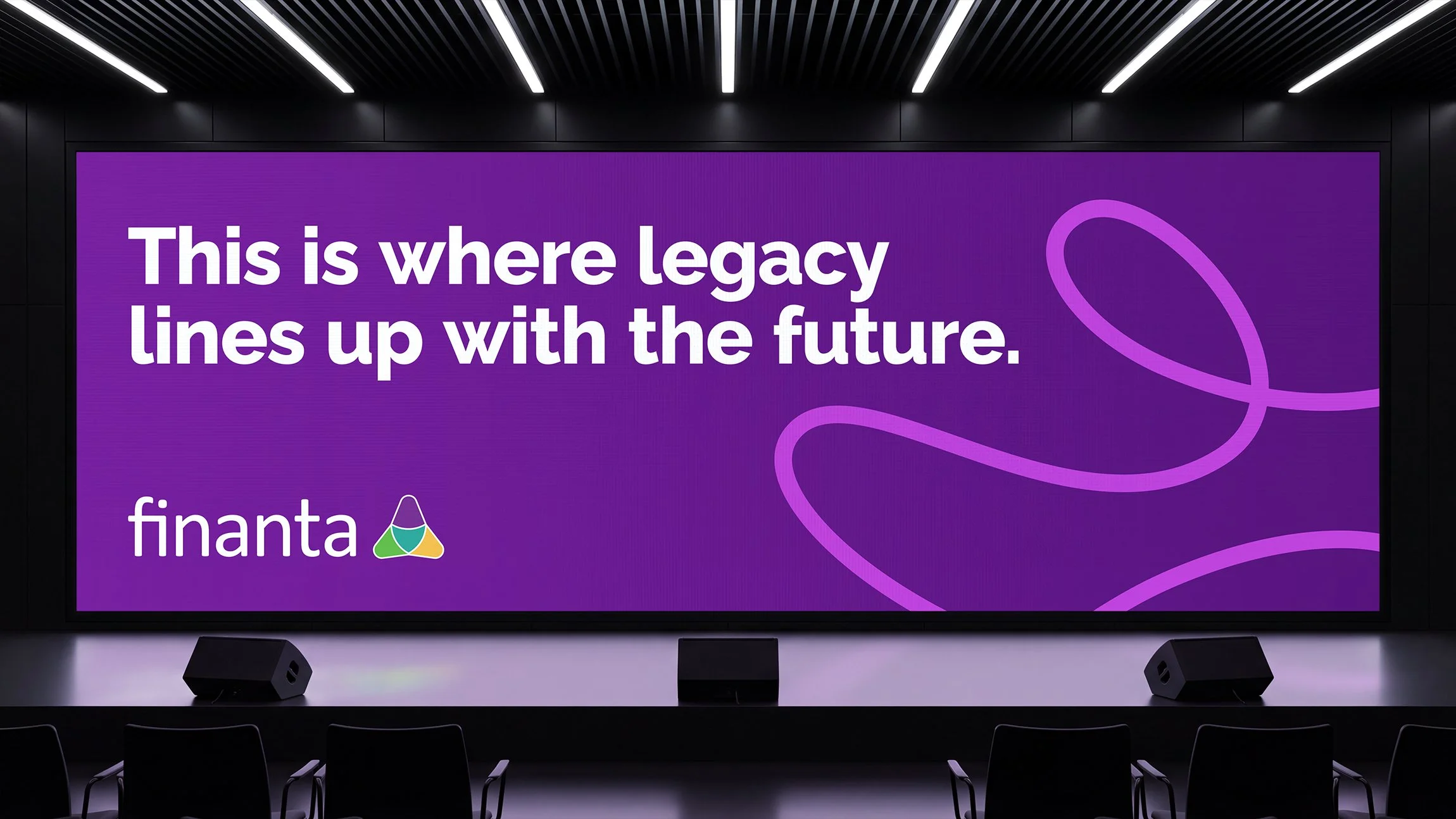

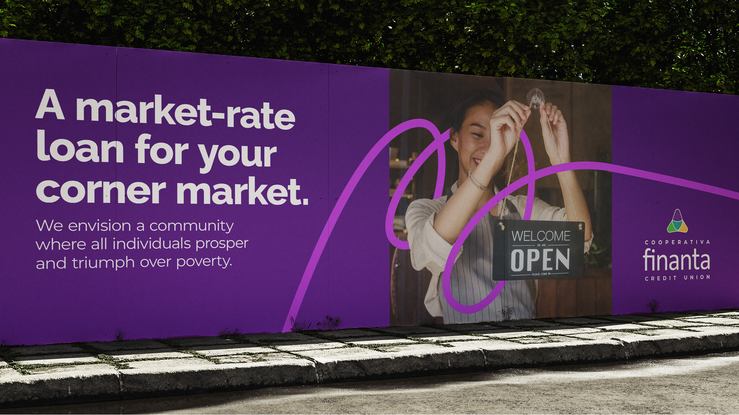
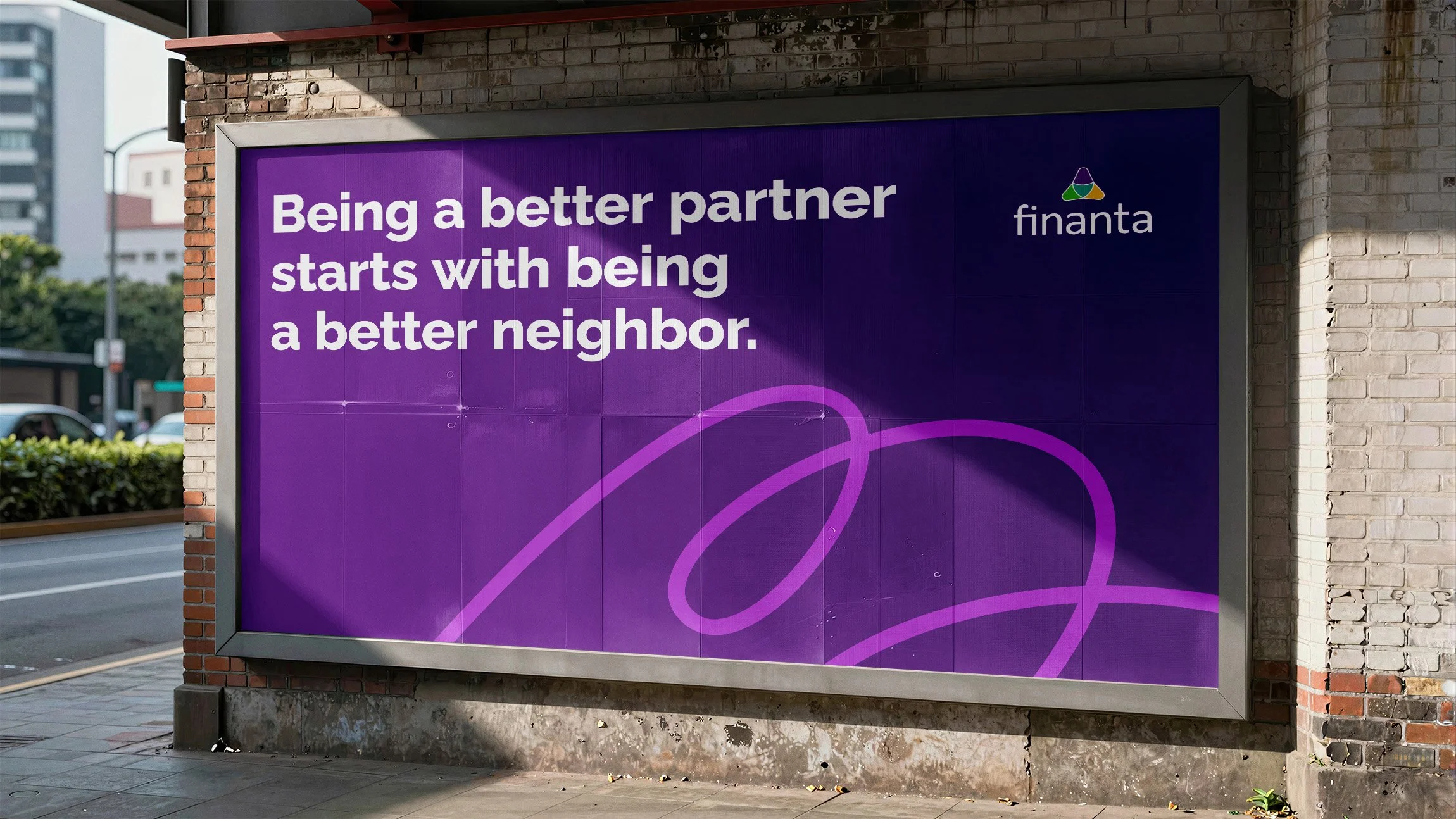
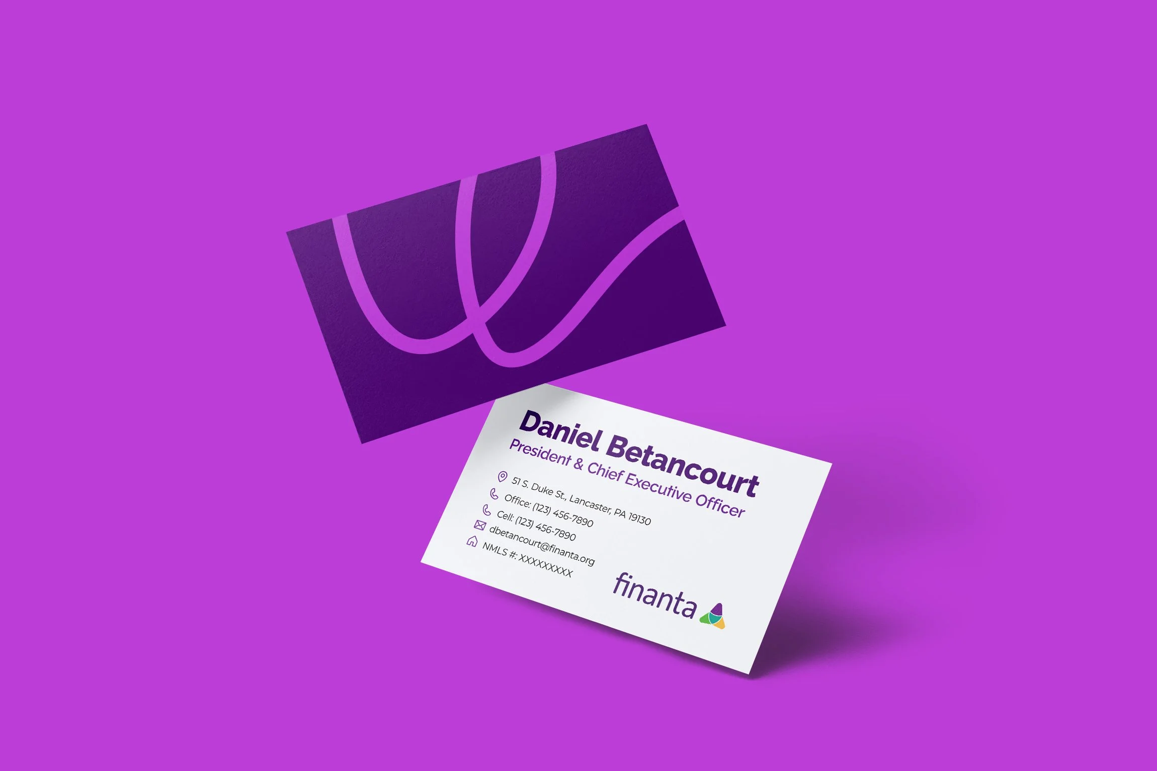
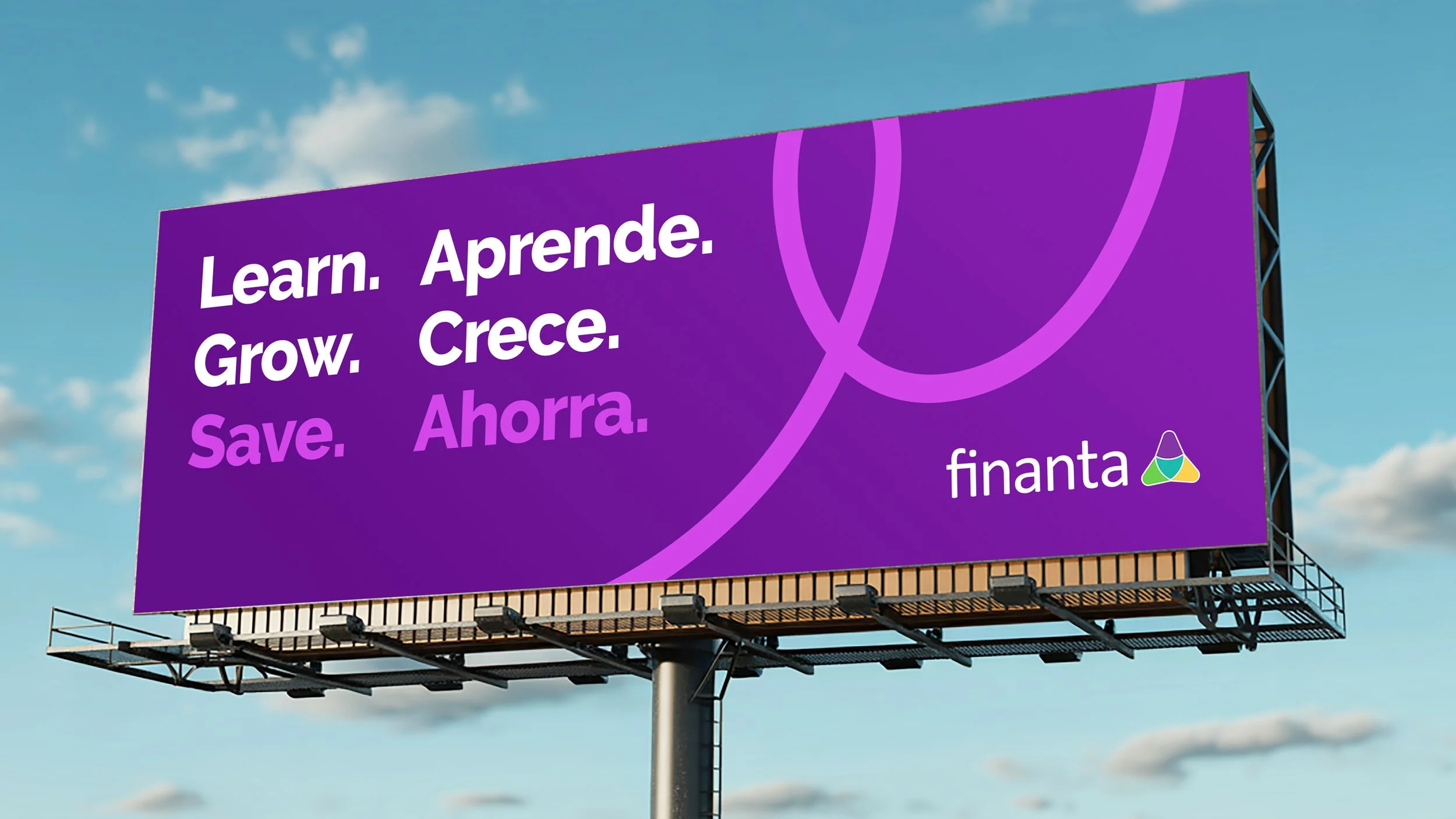
We began with a symbol that tied all of the brand elements together. We call it The Thread. It represents Finanta’s multiple pathways to financial support and the cultural connections extending throughout communities. Its fluid form feels uplifting and conveys motion, signifying a shared purpose and positive momentum.
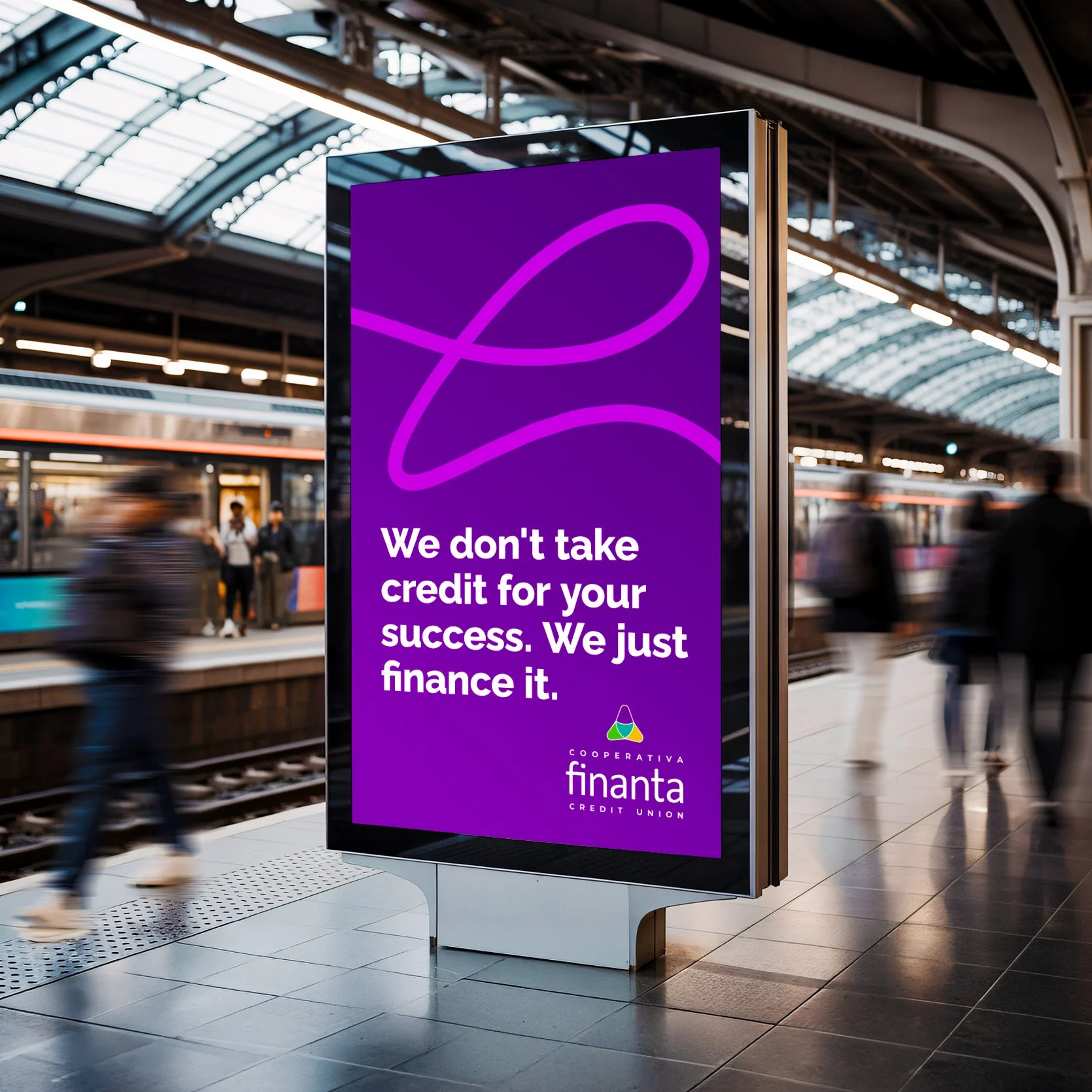
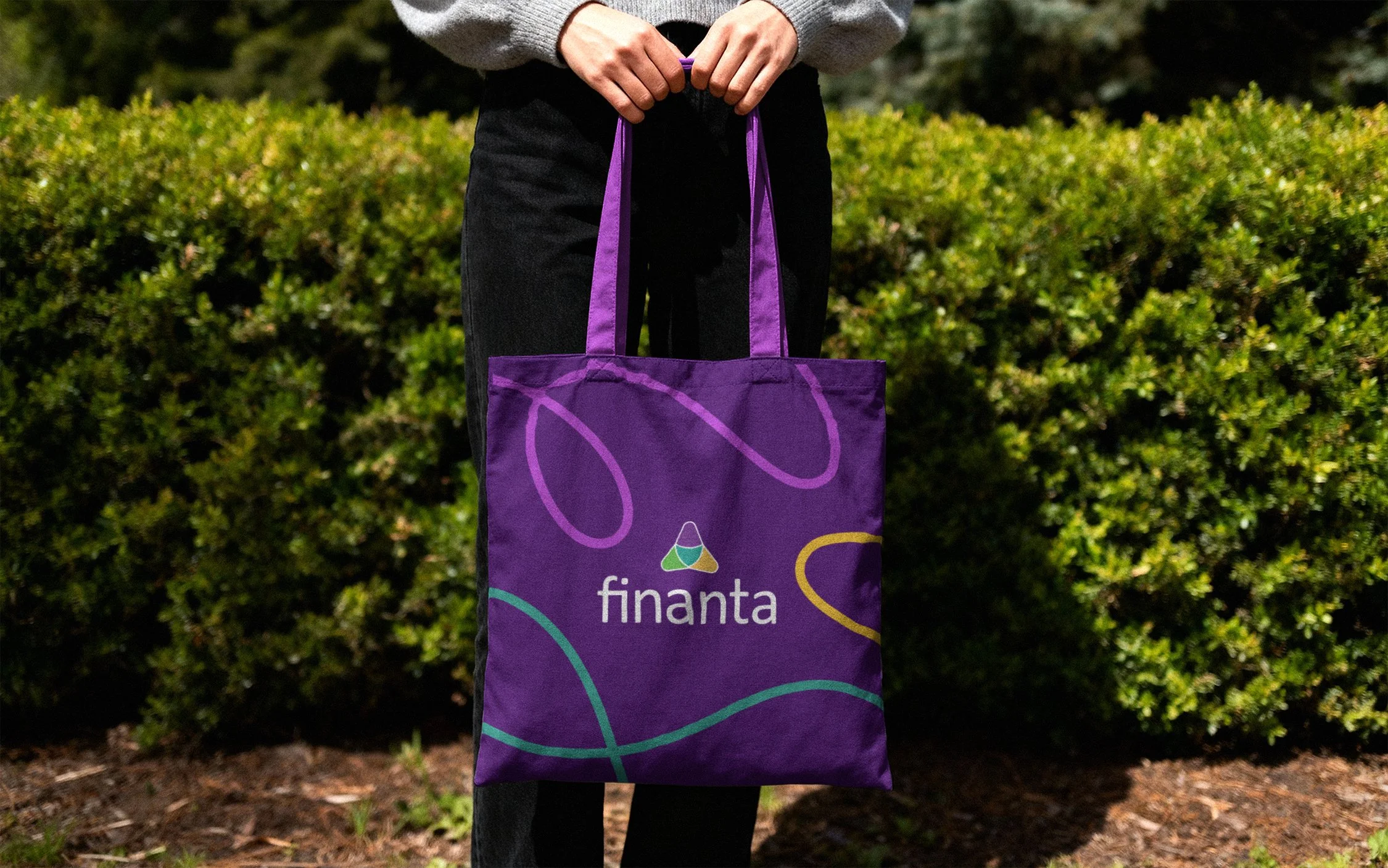
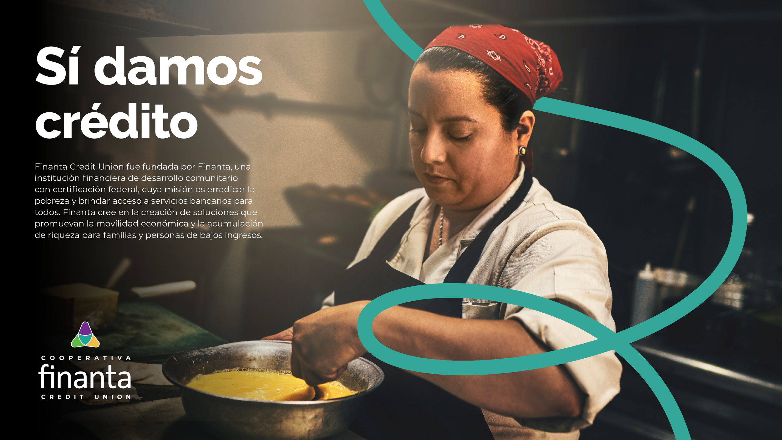
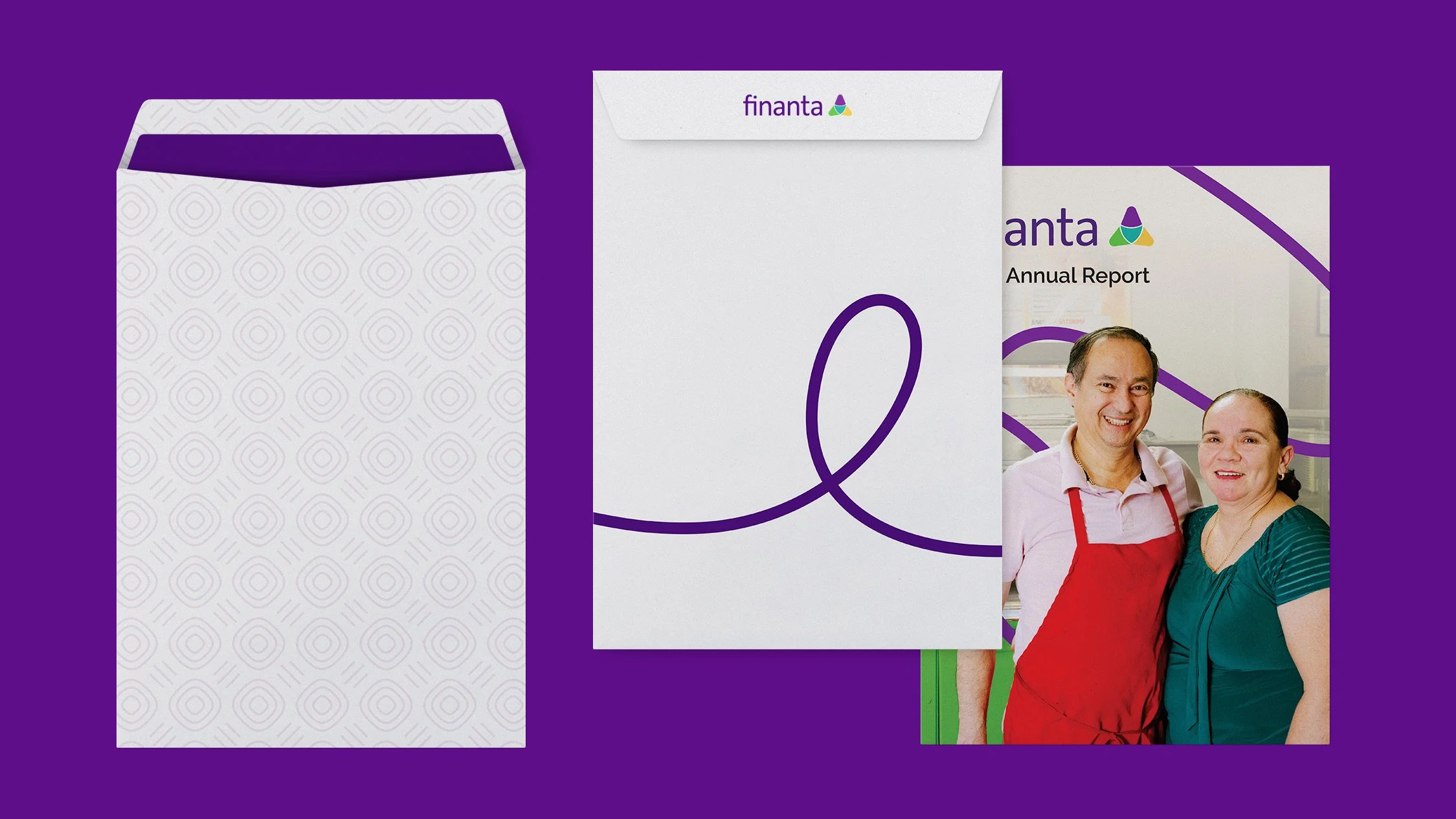

Trigonolitos, or three-cornered stones, symbolize long-term growth in many indigenous Latino cultures. They carry a deep meaning with Finanta and their logo is greatly inspired by them. Understanding this, we made vector cutout shapes to frame photography and other branded designs, bringing another dimension of expression to visuals.


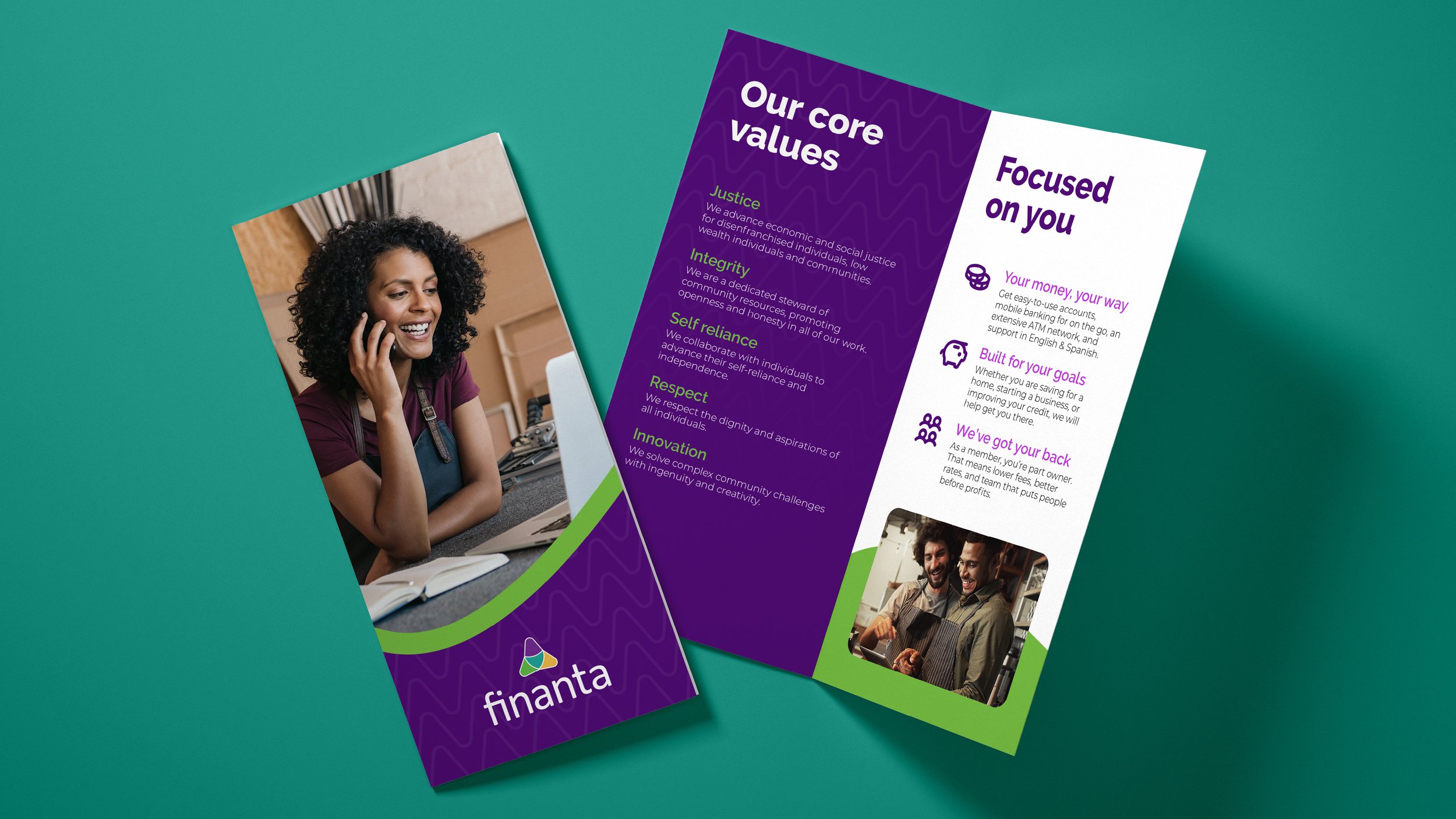
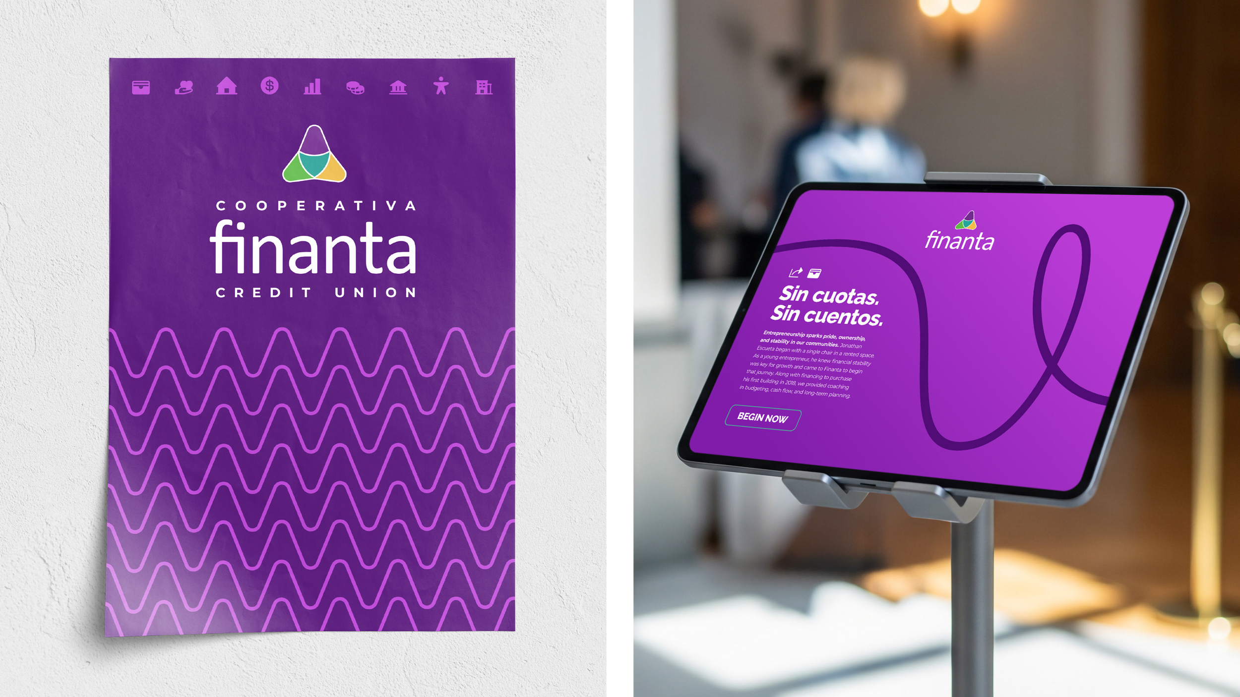
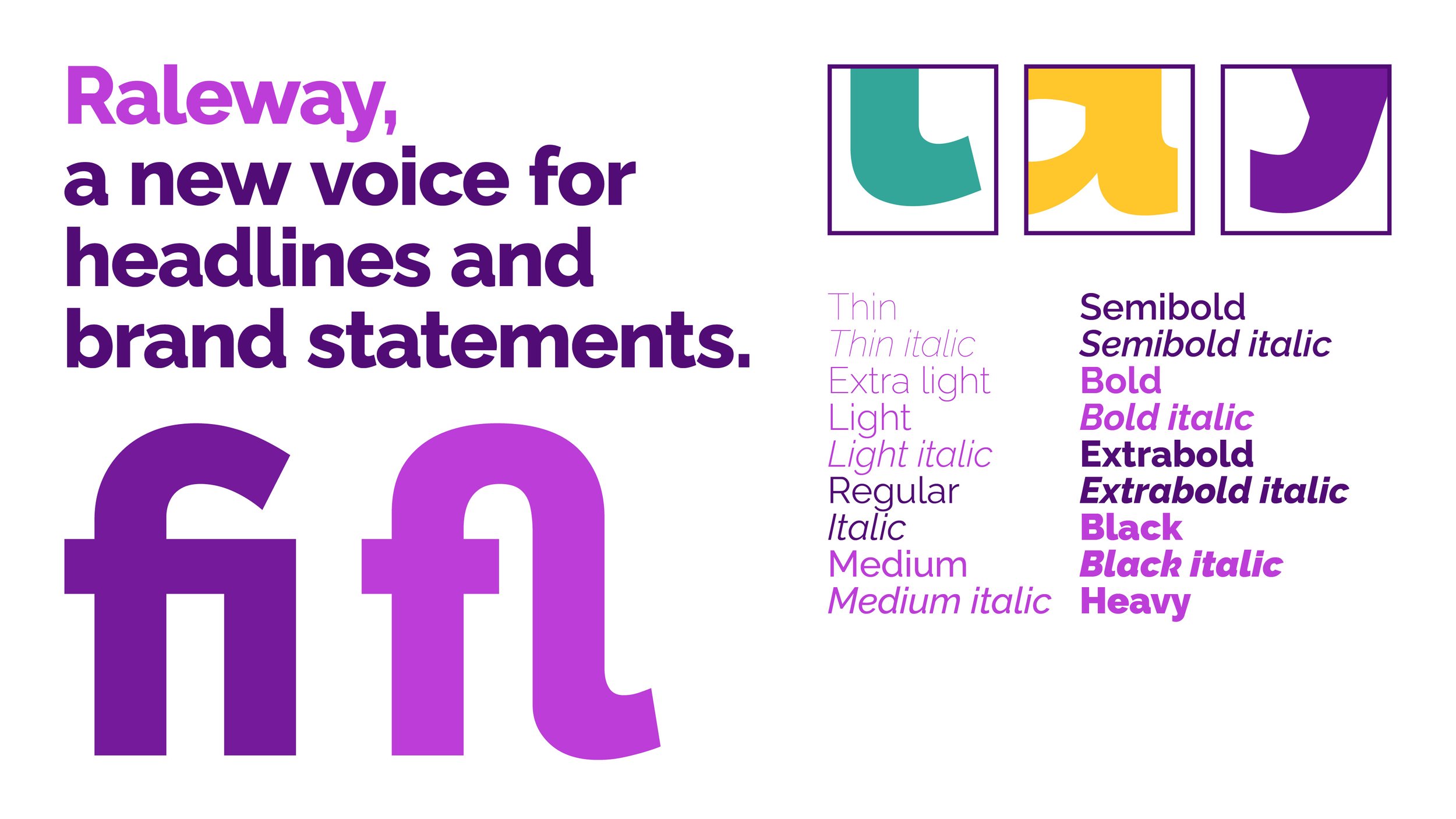
For the typography, we chose Raleway as the new primary font. This versatile typeface delivered a natural friendliness to the credit union’s refreshed personality while interconnecting new and existing brand elements.
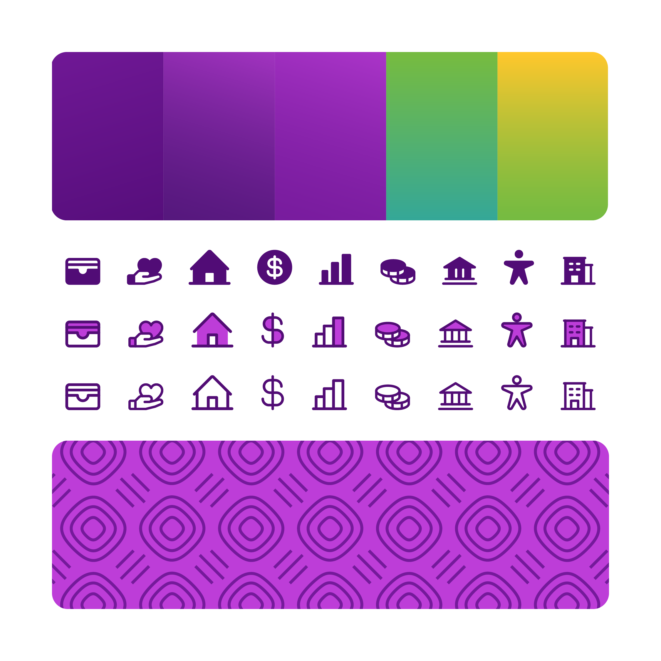
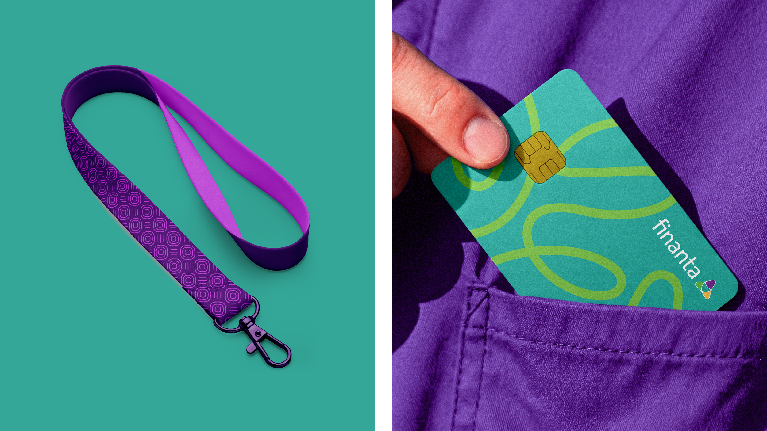
With the brand system’s foundation set, we expanded its dynamic range. We added gradients to further express the brand color palette, introduced distinctive patterns, and developed bespoke icons to represent brand pillars and Latino cultural influences. A curated library of icons complemented these elements, providing consistent visual language across a wide range of applications.