Mendoza Brand Identity
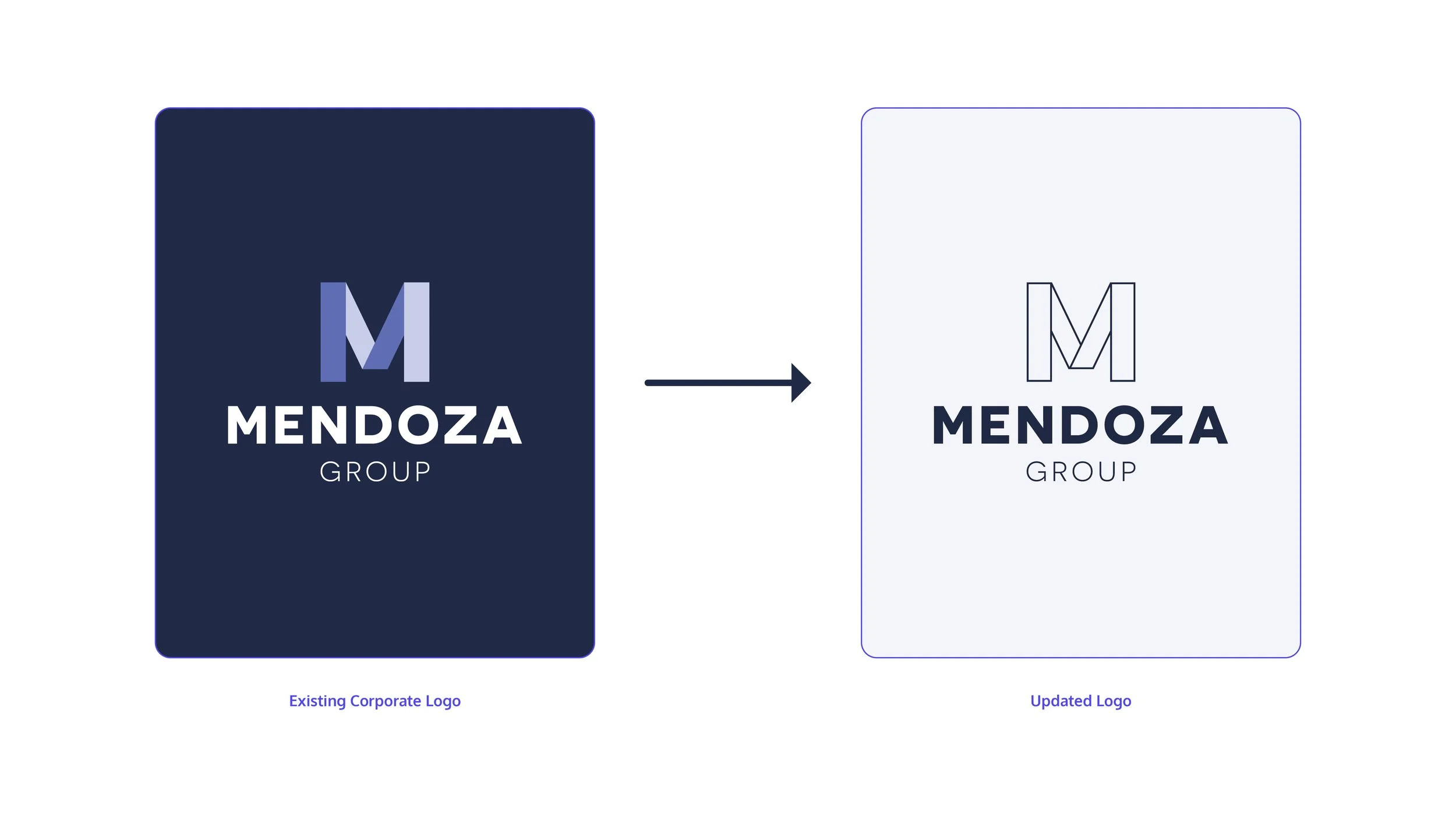
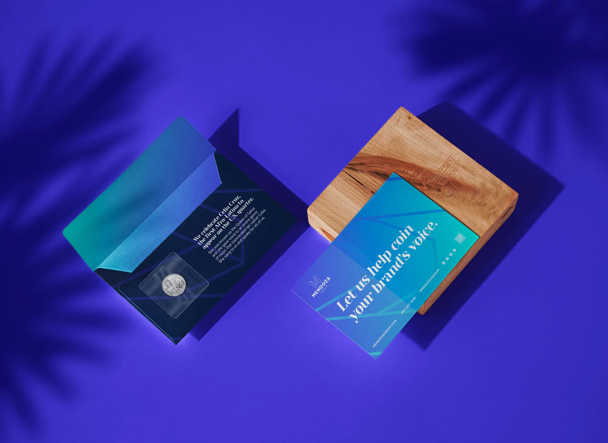
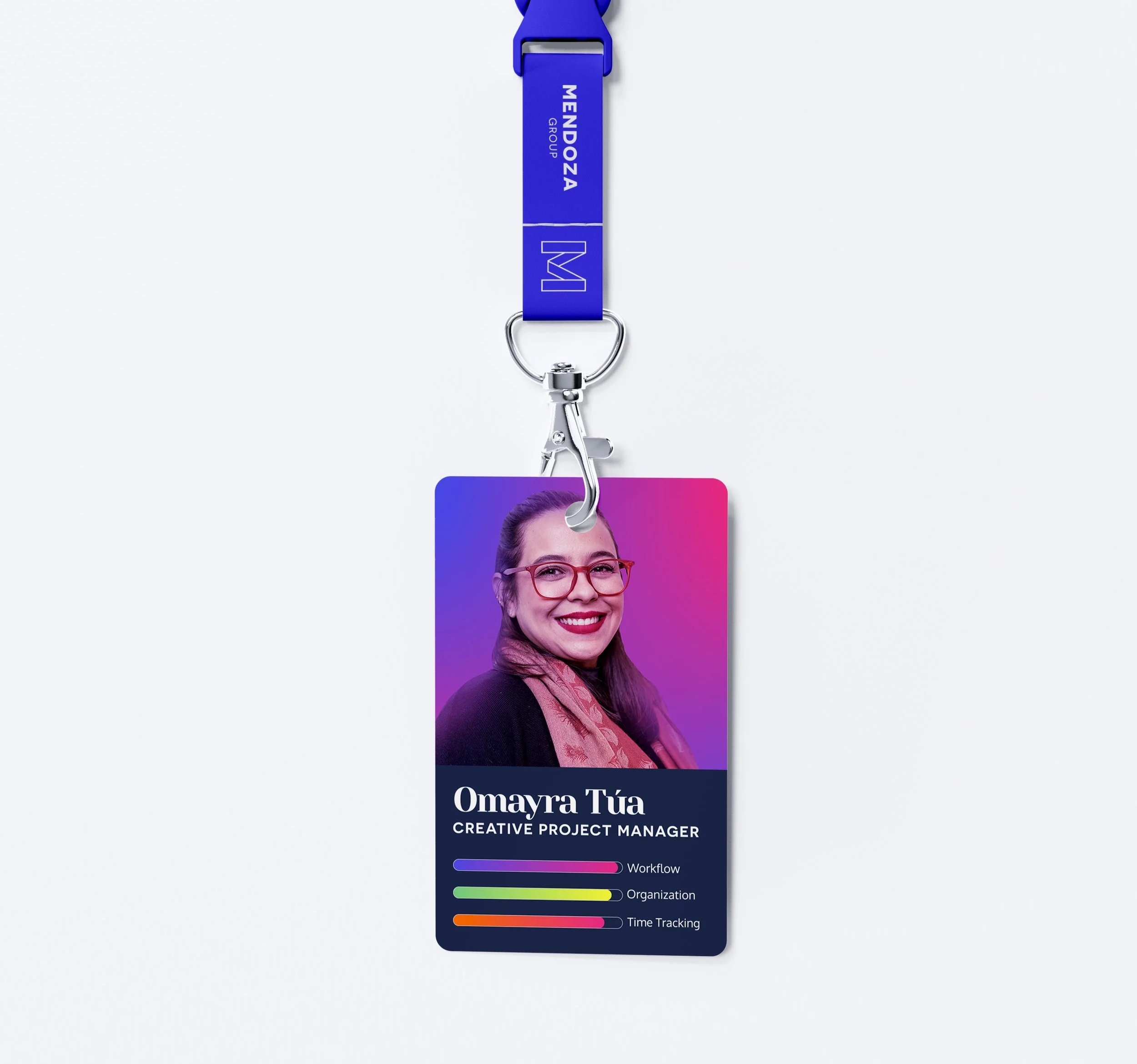
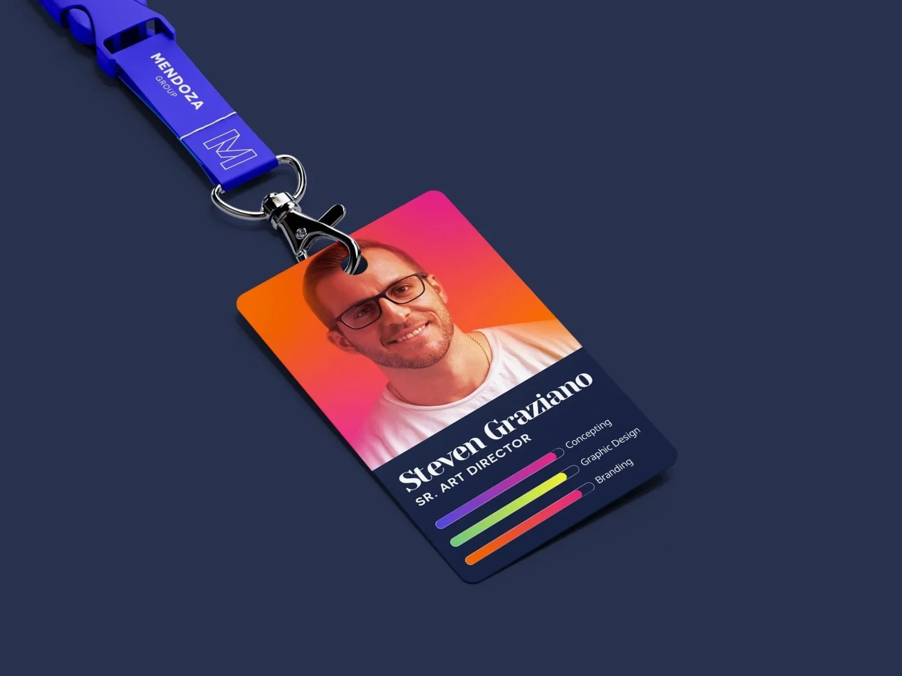
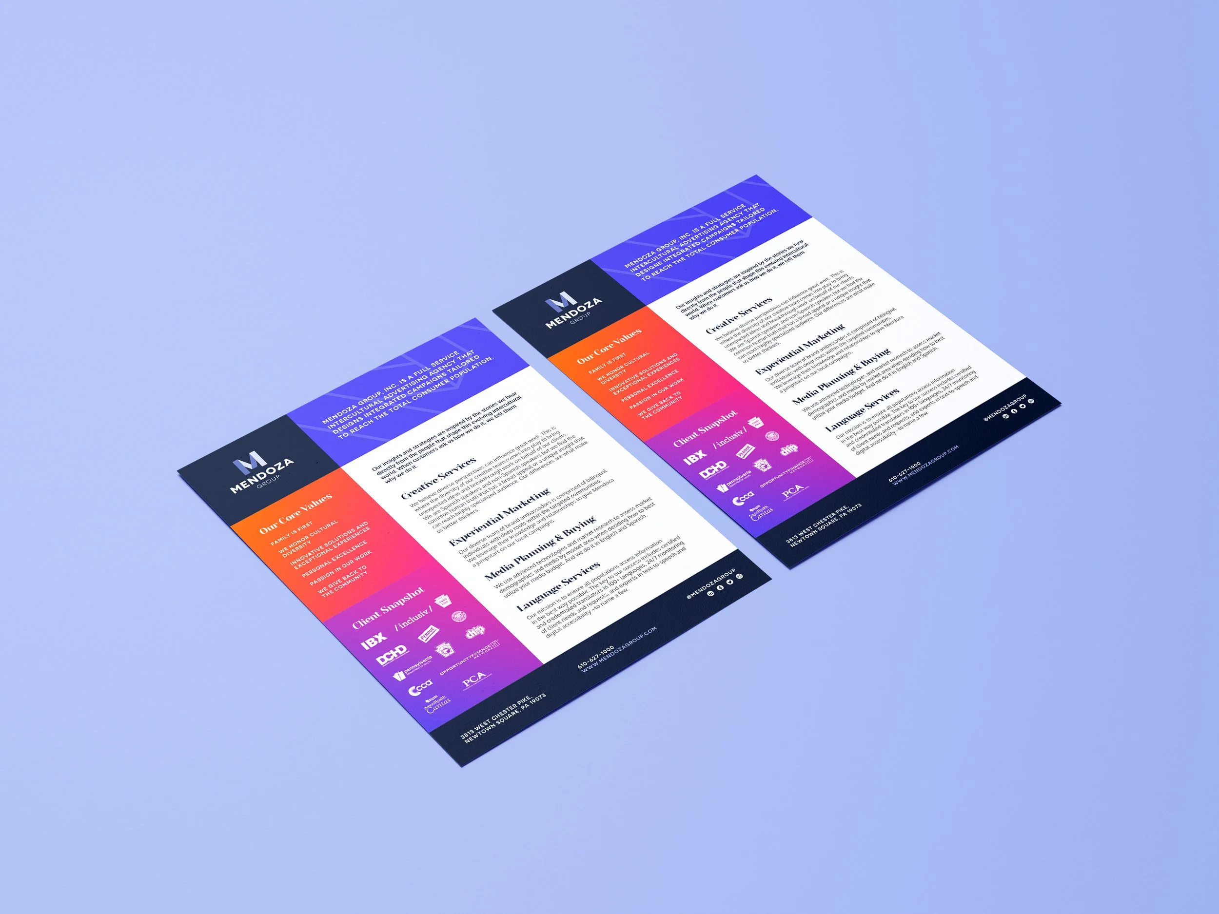
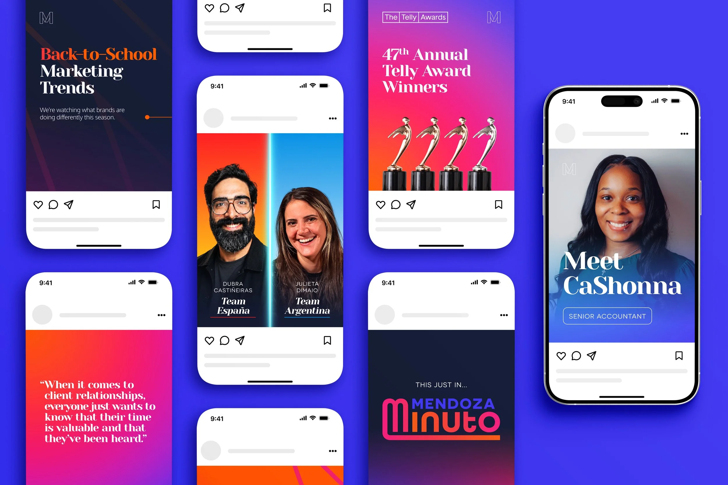
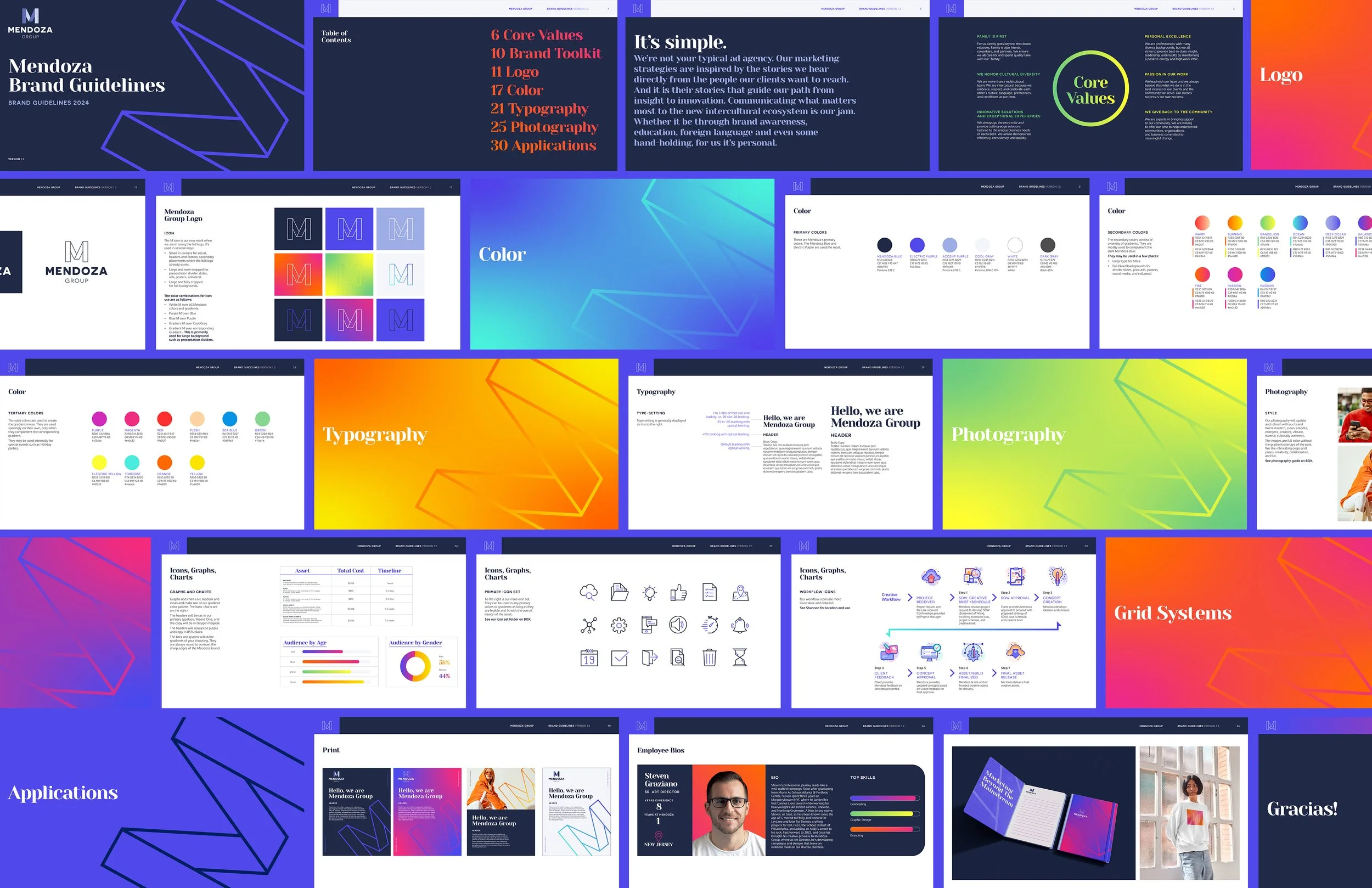
When I first arrived at Mendoza I was tasked with something they have been wanting to do for years; create a fresh, unified brand identity. The goal was to design a modern, sleek brand while maintaining the latino flair that drives our core values.
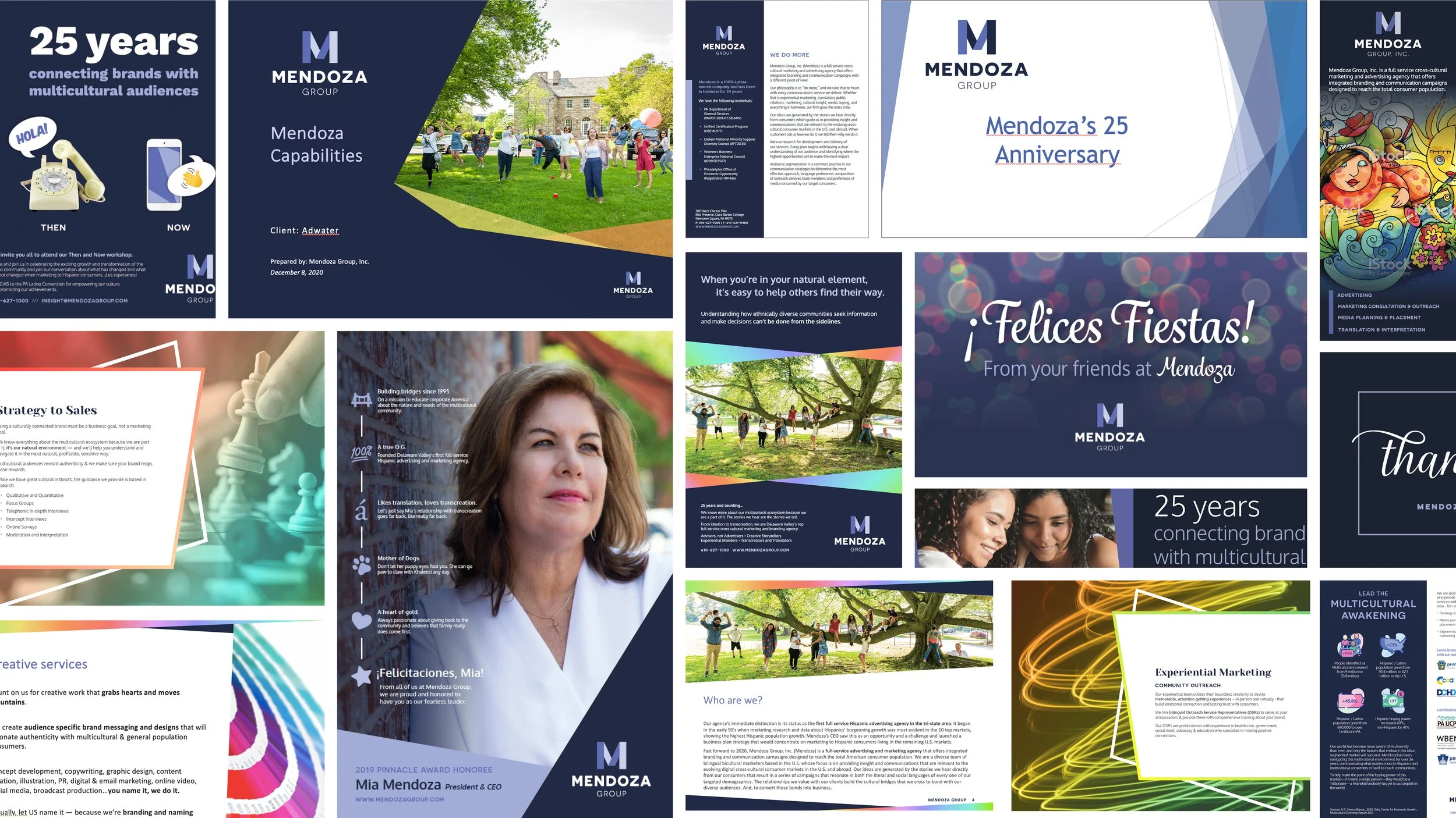
The previous identity had moments of cohesion, but it ultimately felt dated and lacked the distinct energy needed to feel truly fresh and ownable. While the foundation was functional, it didn’t fully capture Mendoza’s evolving vision or create a memorable, differentiated presence in the market.
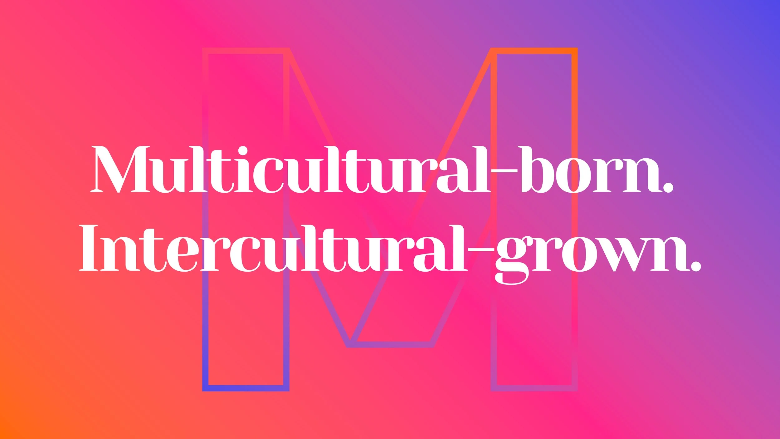
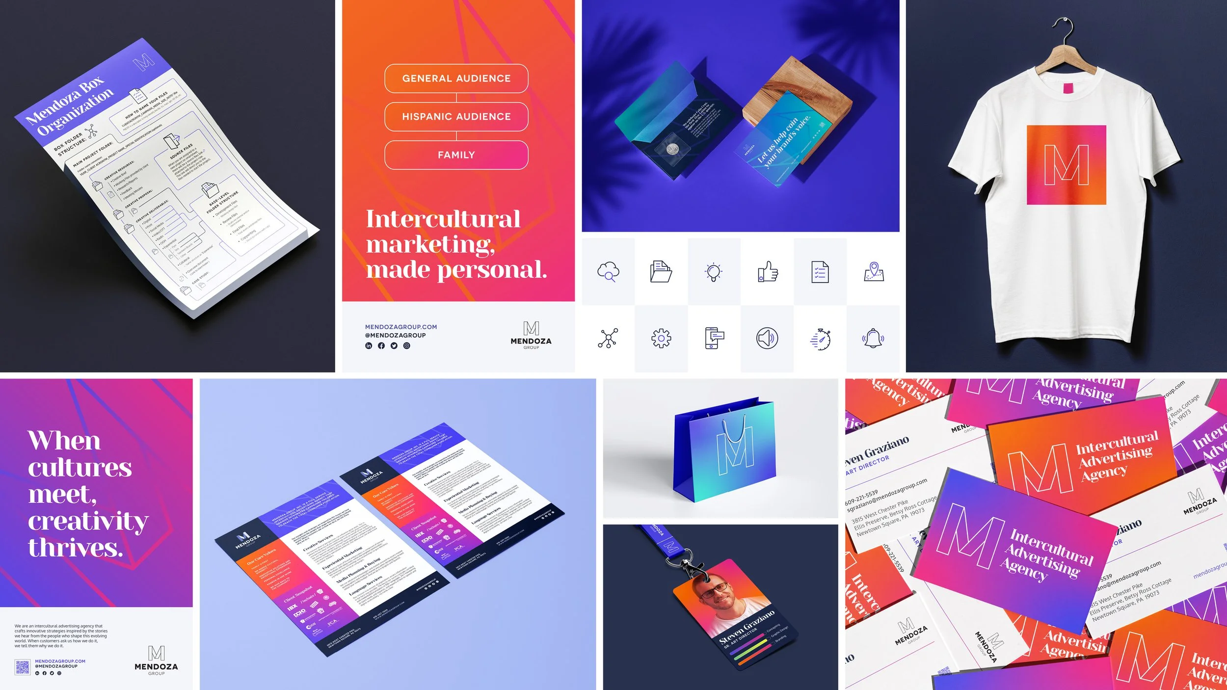
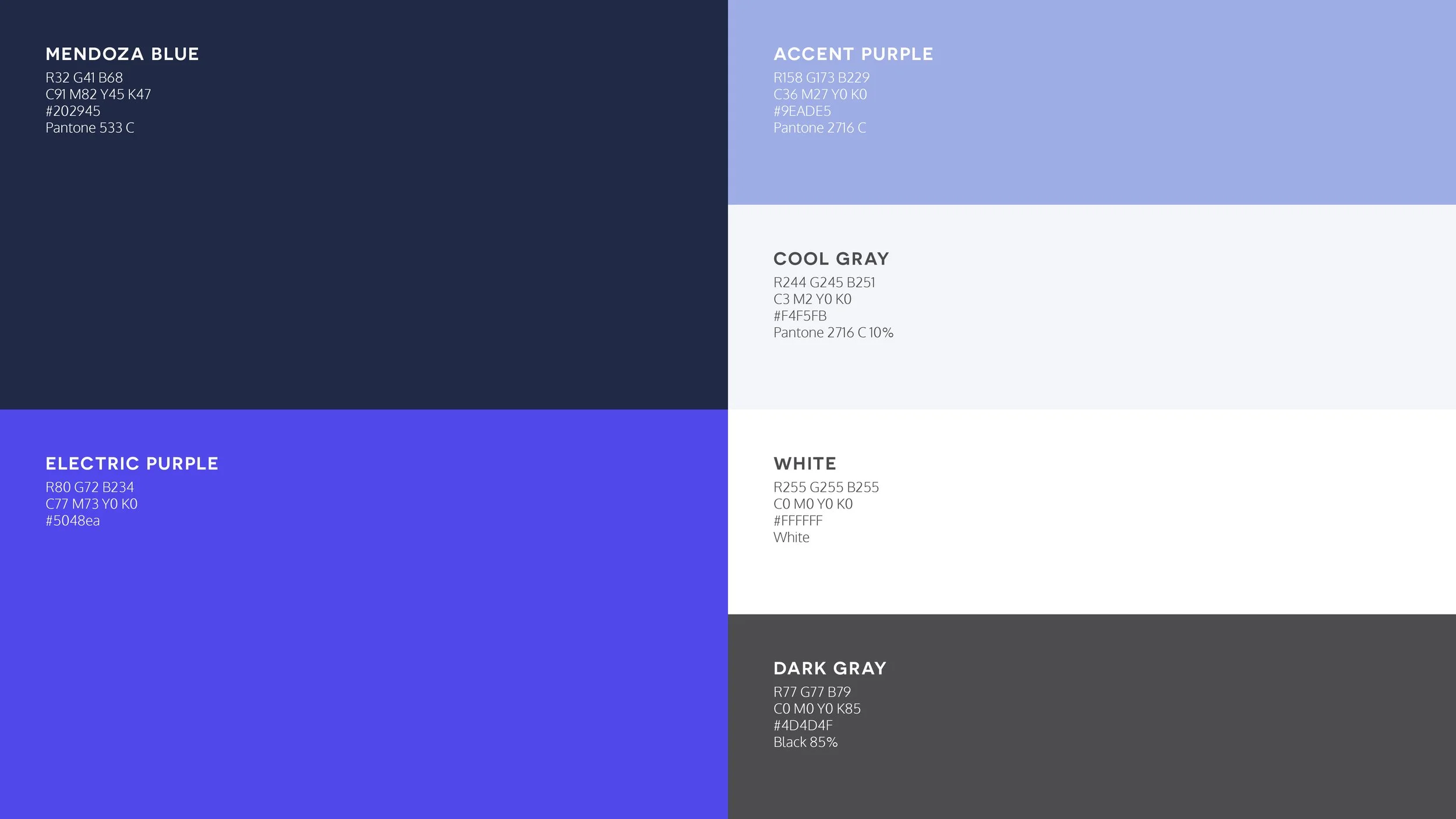
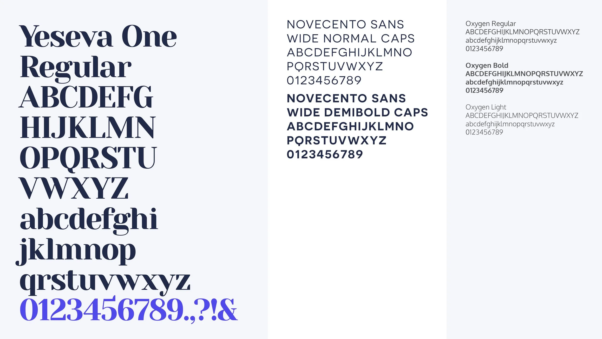
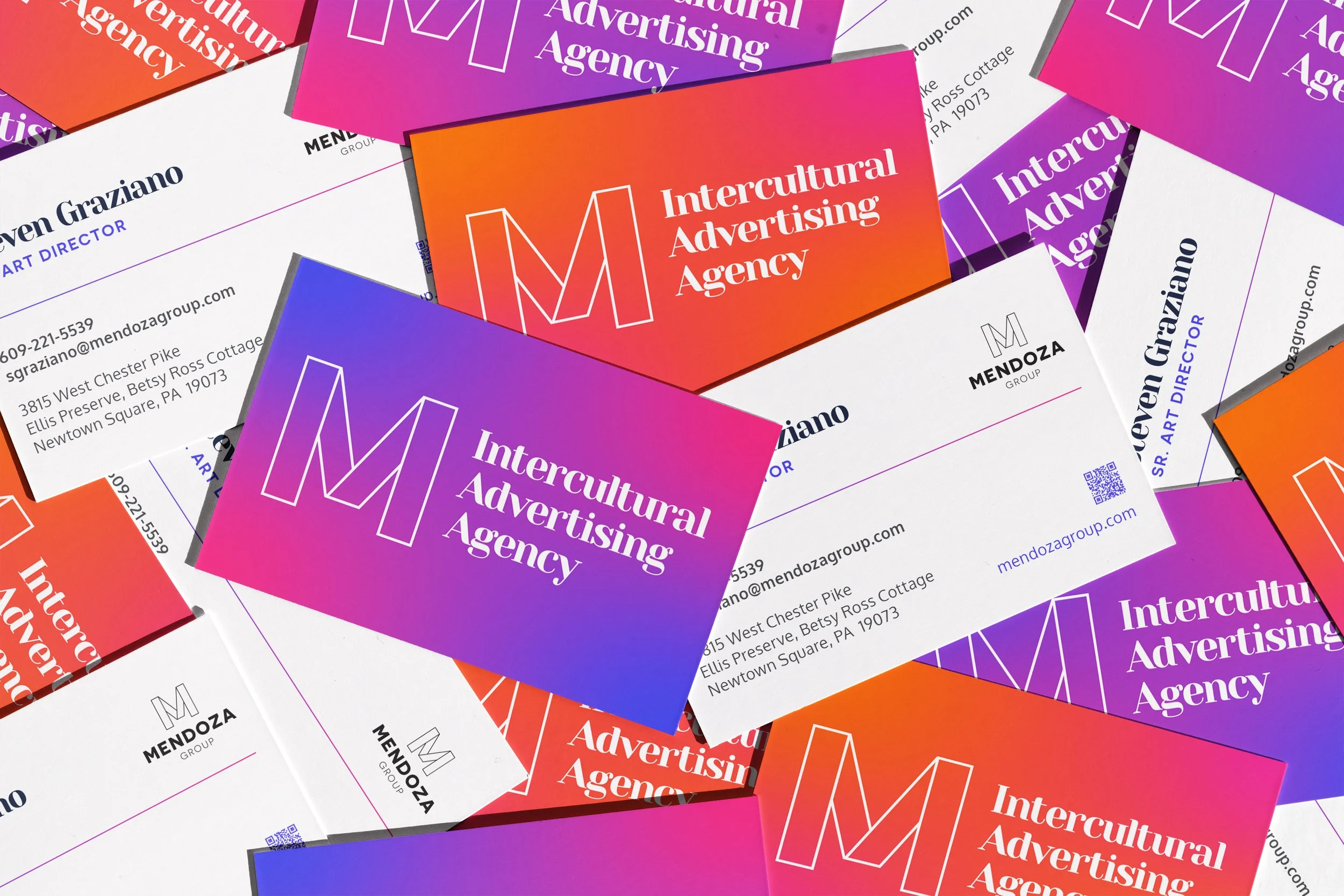
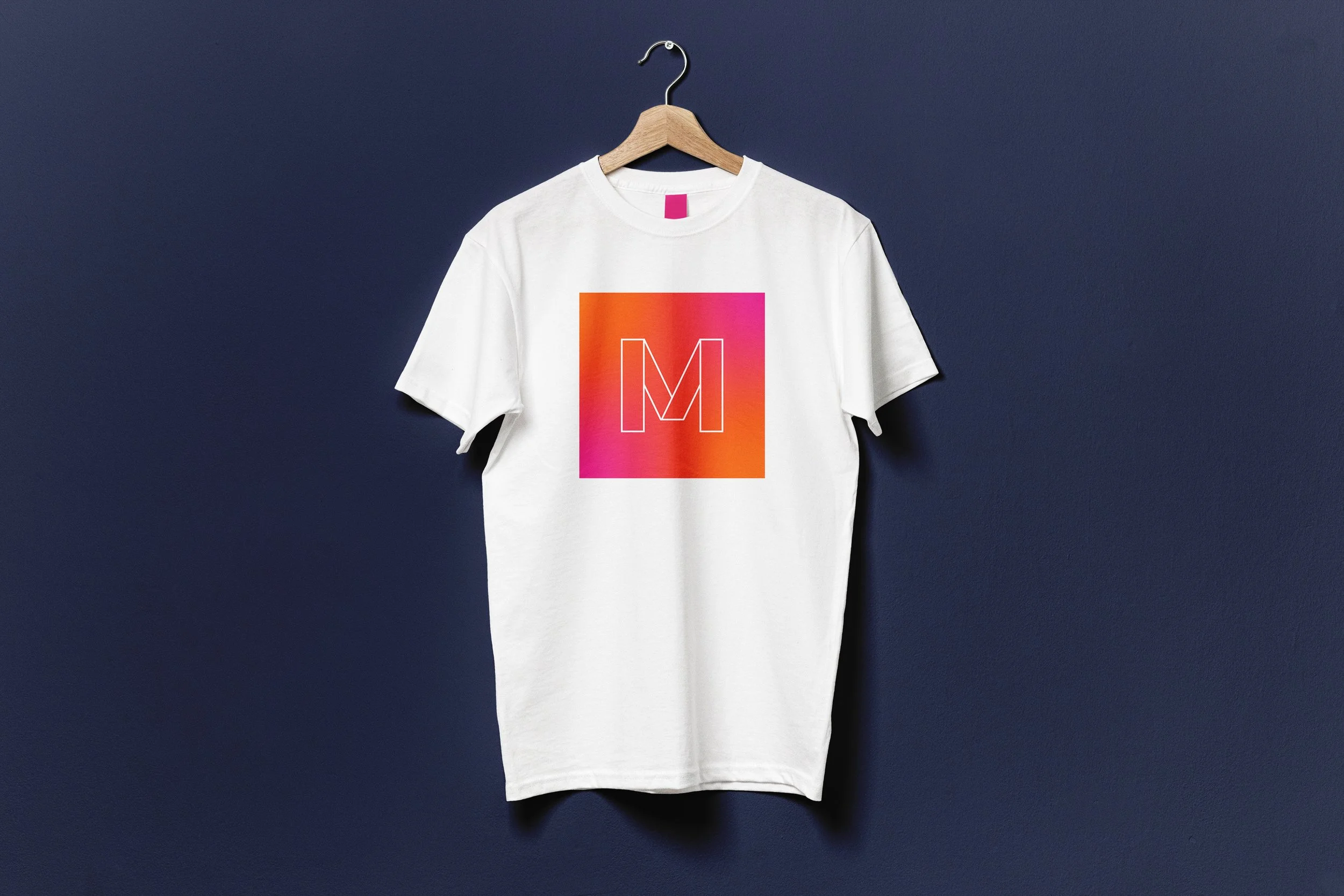
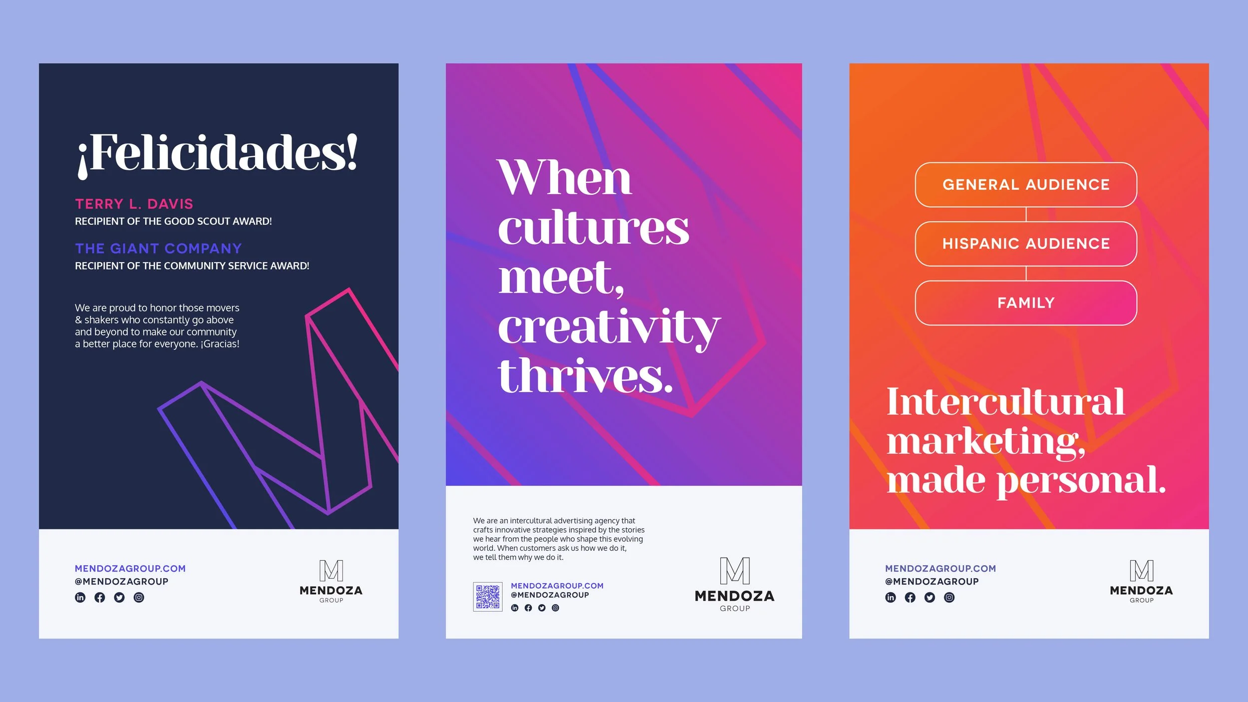
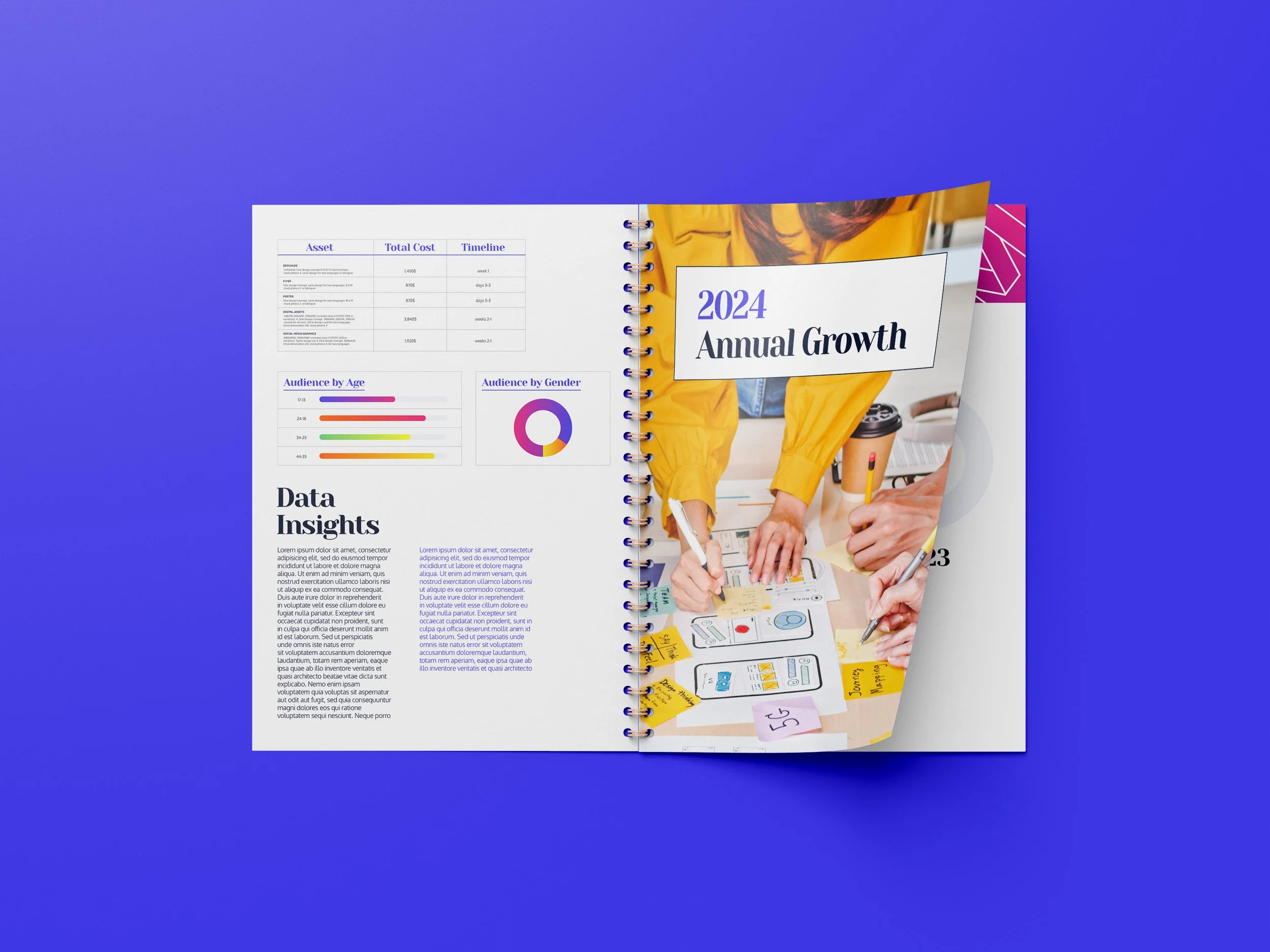
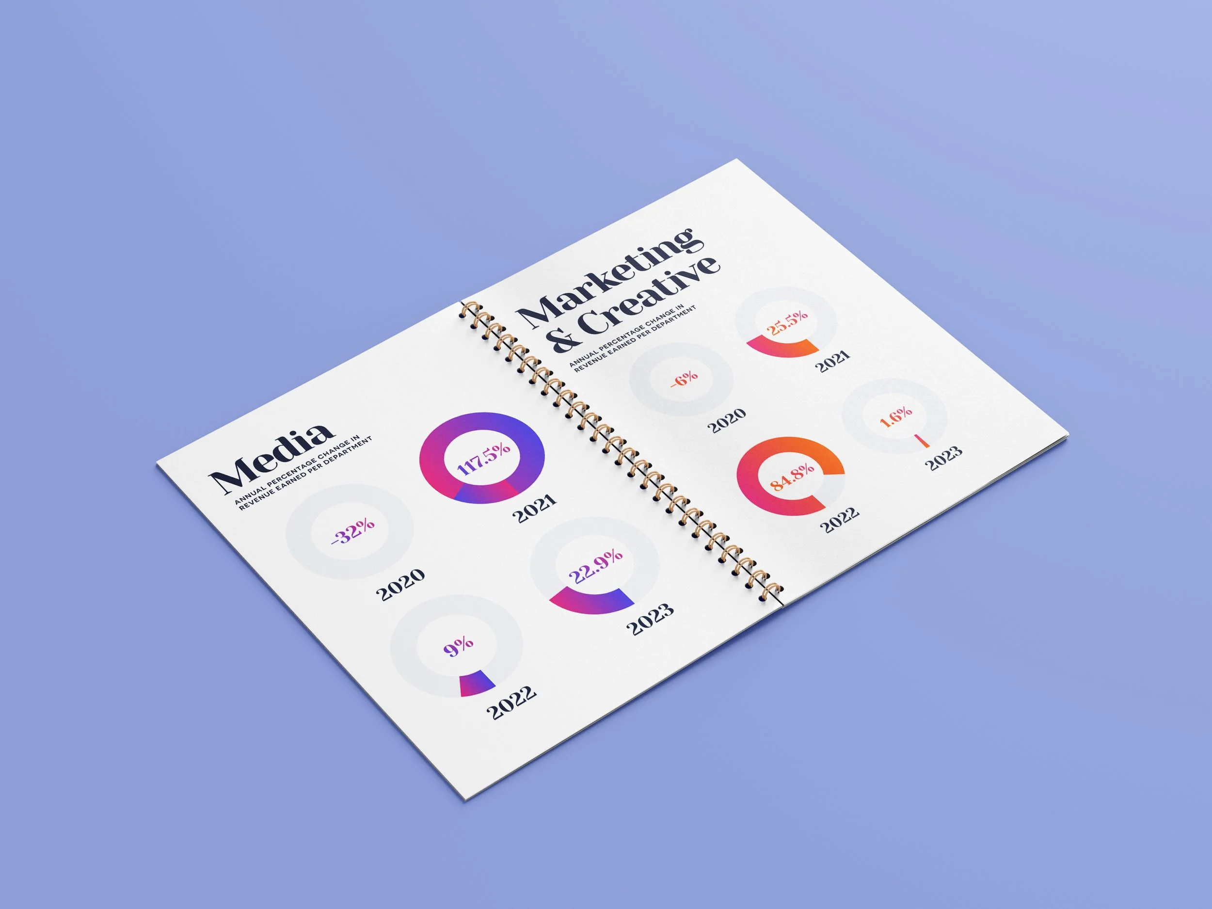
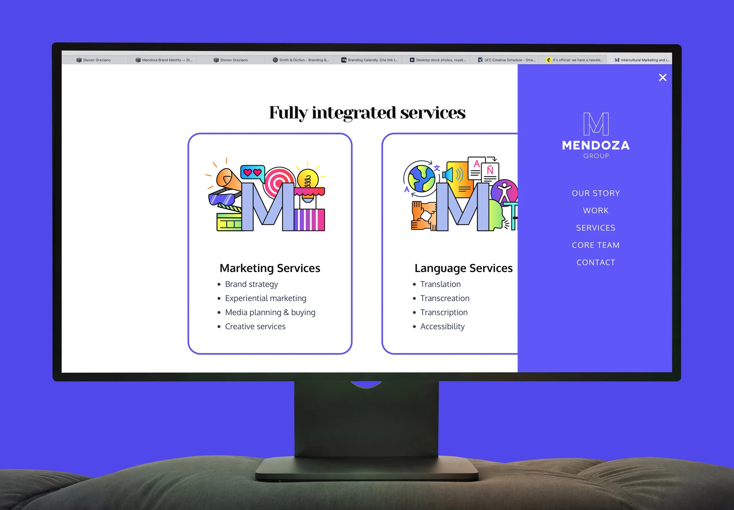
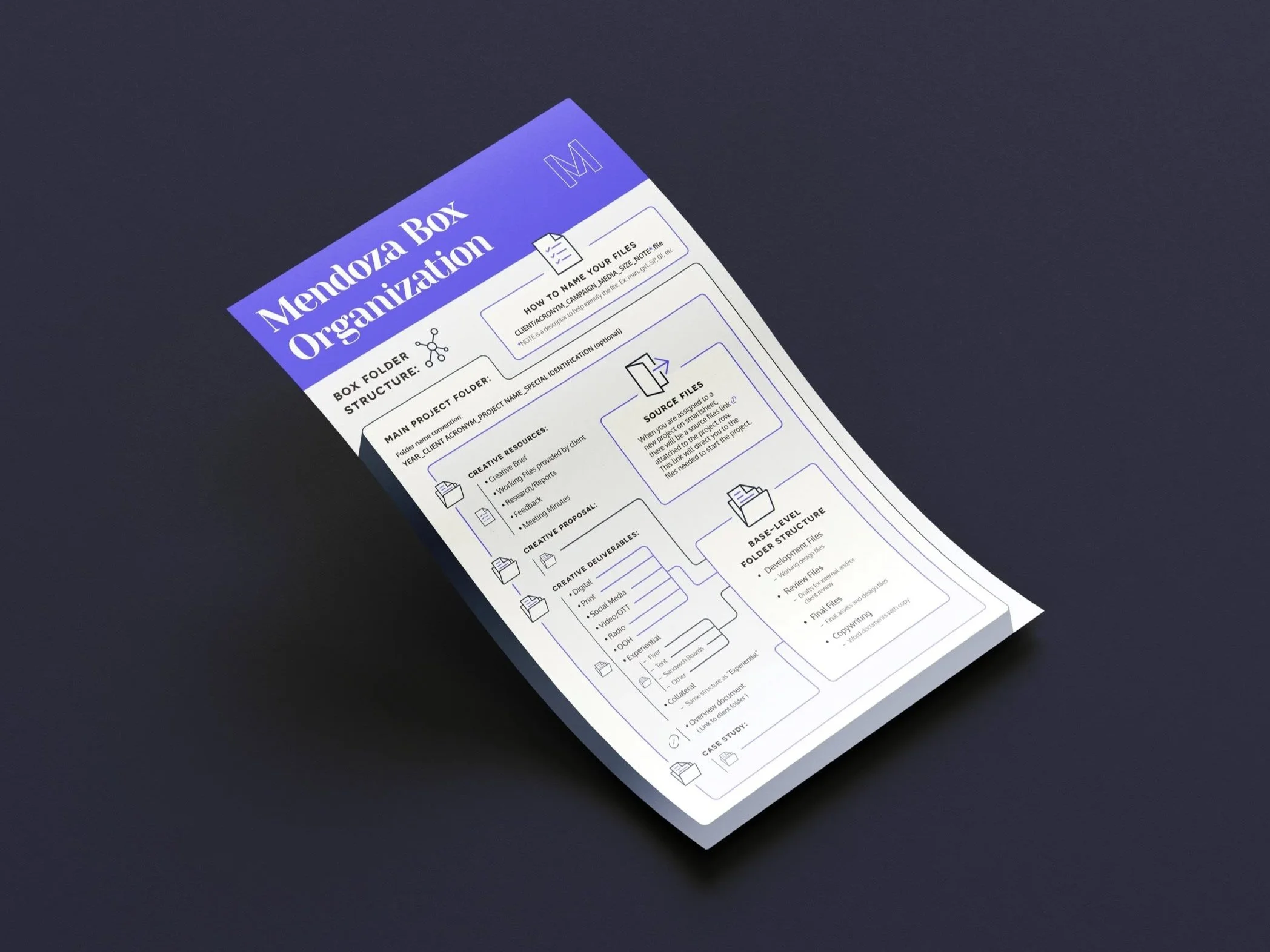
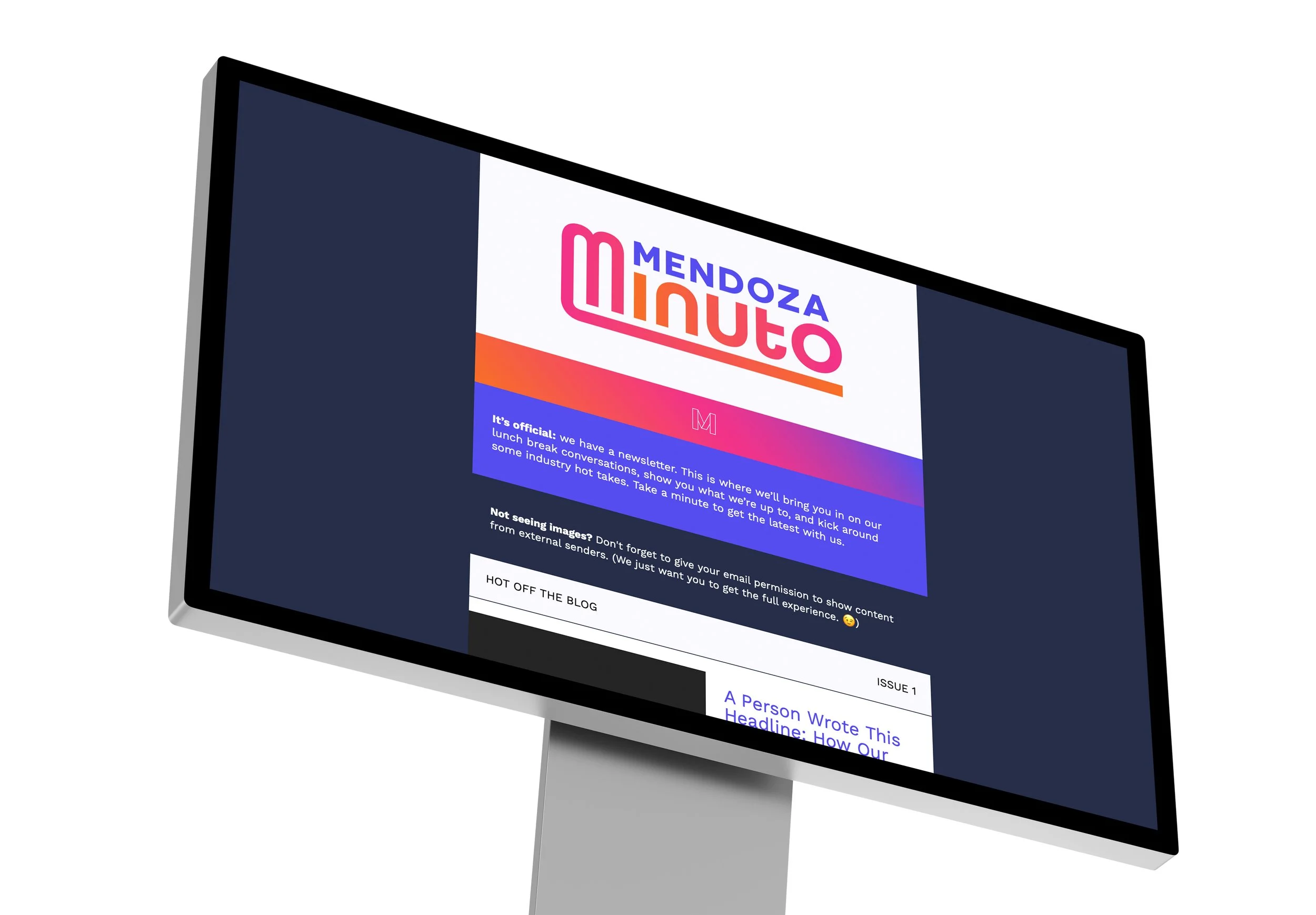
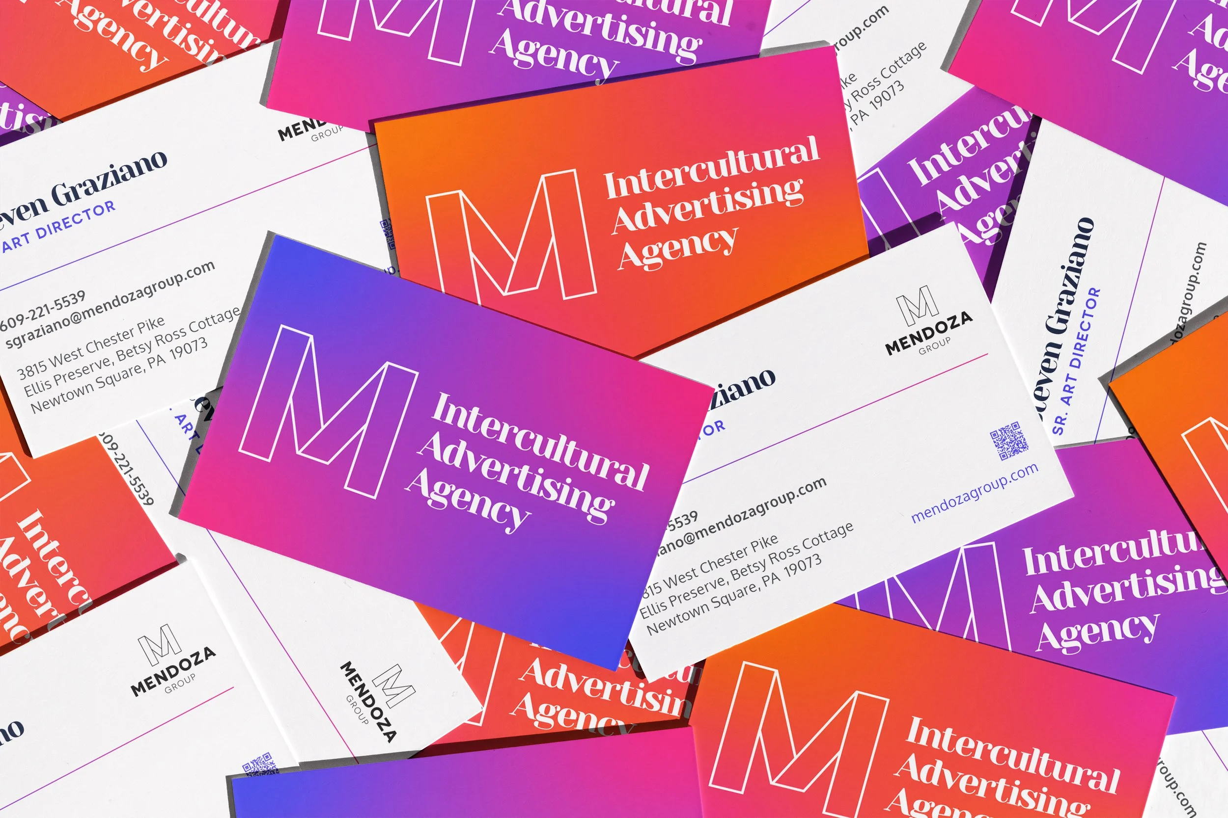
The new identity features a variety of new elements: updated color palette with new gradients, an alternate logo, more precise typography, layouts and hierarchy, new suite of icons, refreshed website, brand guidelines and intercultural brand positioning. Visuals and language all coming together to create something unique, modern, and fully Mendoza.